
In partnership with

What Top Execs Read Before the Market Opens

The Daily Upside was founded by investment professionals to arm decision-makers with market intelligence that goes deeper than headlines. No filler. Just concise, trusted insights on business trends, deal flow, and economic shifts—read by leaders at top firms across finance, tech, and beyond.
🚀 Your Investing Journey Just Got Better: Premium Subscriptions Are Here! 🚀
It’s been 4 months since we launched our premium subscription plans at GuruFinance Insights, and the results have been phenomenal! Now, we’re making it even better for you to take your investing game to the next level. Whether you’re just starting out or you’re a seasoned trader, our updated plans are designed to give you the tools, insights, and support you need to succeed.
Here’s what you’ll get as a premium member:
Exclusive Trading Strategies: Unlock proven methods to maximize your returns.
In-Depth Research Analysis: Stay ahead with insights from the latest market trends.
Ad-Free Experience: Focus on what matters most—your investments.
Monthly AMA Sessions: Get your questions answered by top industry experts.
Coding Tutorials: Learn how to automate your trading strategies like a pro.
Masterclasses & One-on-One Consultations: Elevate your skills with personalized guidance.
Our three tailored plans—Starter Investor, Pro Trader, and Elite Investor—are designed to fit your unique needs and goals. Whether you’re looking for foundational tools or advanced strategies, we’ve got you covered.
Don’t wait any longer to transform your investment strategy. The last 4 months have shown just how powerful these tools can be—now it’s your turn to experience the difference.

As an investor or a trader, you are always trying to understand which stocks in which sectors should you invest or trade in. Relative Rotation Graphs (RRG), introduced by Julius de Kempenaer, is like a map of this marketplace for investors/traders, showing which sectors are stealing the spotlight and which are fading into the background.
Relative Rotation Graphs (RRG) is a powerful tool for visualising the relative performance of various sectors or stocks. By plotting data on a two-dimensional graph based on their relative strength and momentum, RRG helps investors to identify outperforming and underperforming sectors or stocks over time.
He’s already IPO’d once – this time’s different

Spencer Rascoff grew Zillow from seed to IPO. But everyday investors couldn’t join until then, missing early gains. So he did things differently with Pacaso. They’ve made $110M+ in gross profits disrupting a $1.3T market. And after reserving the Nasdaq ticker PCSO, you can join for $2.80/share until 5/29.
This is a paid advertisement for Pacaso’s Regulation A offering. Please read the offering circular at invest.pacaso.com. Reserving a ticker symbol is not a guarantee that the company will go public. Listing on the NASDAQ is subject to approvals. Under Regulation A+, a company has the ability to change its share price by up to 20%, without requalifying the offering with the SEC.
In this article, we will:
Explain the concept of RRG ratios (RS-Ratio and RS-Momentum).
Use Python to calculate RRG ratios for major Indian market sectors like FMCG, IT, Realty, Banking etc. using the
yfinancelibrary.Visualise the RRG ratios to assess sector performance.

Understanding RRG Ratios
RS-Ratio (Relative Strength Ratio): Measures the relative strength of an asset against a benchmark index. In this article I have used Nifty 50 as the benchmark. Think of RS-Ratio as a popularity score — it tells us how strong a sector/stock is compared to a benchmark index.
RS-Momentum: Measures the momentum of the relative strength, highlighting recent trends. This metric is measuring the buzz factor. It shows how quickly that popularity is changing.
When you combine these two, you get a dynamic view of how sectors/stocks move through four quadrants:
Leading: High RS-Ratio and high RS-Momentum. These are the rockstars, basking in the limelight.
Weakening: High RS-Ratio but declining RS-Momentum. These are the once-hot stars now struggling to keep up.
Lagging: Low RS-Ratio and low RS-Momentum. As the name suggests these are the laggards, lacking both strength and momentum.
Improving: Low RS-Ratio but increasing RS-Momentum. These are the stars in the making, quietly building the buzz.
Rolling Up Our Sleeves: Python to the Rescue
tickers =['^CNXFMCG','^CNXIT','^CNXMETAL','^CNXPSUBANK','^CNXPSE','^CNXINFRA', '^CNXMEDIA', '^CNXENERGY','^CNXREALTY', '^CNXAUTO']
period = '2y'
benchmark = '^NSEI'
window = 55 #lookback period for which you want to calculate the relative strength


rs_tickers = []
rsr_tickers = []
rsr_roc_tickers = []
rsm_tickers = []

def load_data():
    ticker_data = yf.download(tickers, period=period, interval="1d")['Adj Close']
    benchmark_data = yf.download(benchmark, period=period, interval="1d")['Adj Close']

def calculateRRG():
    for ticker in tickers:
        rs = 100 * (ticker_data[ticker] / benchmark_data)
        rsr = (100 + (rs - rs.rolling(window=window).mean()) / rs.rolling(window=window).std(ddof=0)).dropna()

        rsr_roc = 100 * ((rsr / rsr.shift(1)) - 1)
        rsm = (101 + ((rsr_roc - rsr_roc.rolling(window=window).mean()) / rsr_roc.rolling(window=window).std(ddof=0))).dropna()


        rs_tickers.append(rs)
        rsr_tickers.append(rsr[rsr.index.isin(rsm.index)])
        rsr_roc_tickers.append(rsr_roc)
        rsm_tickers.append(rsm)

def plotRRG():
    fig, ax = plt.subplots(figsize=(12, 8))
    ax.set_title(f'RRG Indicator (Benchmark: {benchmark})')
    ax.set_xlabel('Relative Strength Ratio')
    ax.set_ylabel('Relative Strength Momentum')

    ax.axhline(y=100, color='k', linestyle='--')
    ax.axvline(x=100, color='k', linestyle='--')

    ax.fill_between([94, 100], [94, 94], [100, 100], color='red', alpha=0.2)
    ax.fill_between([100, 106], [94, 94], [100, 100], color='yellow', alpha=0.2)
    ax.fill_between([100, 106], [100, 100], [106, 106], color='green', alpha=0.2)
    ax.fill_between([94, 100], [100, 100], [106, 106], color='teal', alpha=0.2)

    ax.text(95, 105, 'Improving', fontsize=10)
    ax.text(104, 105, 'Leading', fontsize=10)
    ax.text(104, 95, 'Weakening', fontsize=10)
    ax.text(95, 95, 'Lagging', fontsize=10)

    ax.set_xlim(94, 106)
    ax.set_ylim(94, 106)

    scatter_plots = []
    line_plots = []
    annotations = []

    for i, ticker in enumerate(tickers):
        if not rsr_tickers[i].empty and not rsm_tickers[i].empty:

            scatter = ax.scatter(rsr_tickers[i].iloc[-1], rsm_tickers[i].iloc[-1], color='black', s=50)
            annotation = ax.annotate(ticker, (rsr_tickers[i].iloc[-1], rsm_tickers[i].iloc[-1]), fontsize=8)

            scatter_plots.append(scatter)
            line_plots.append(line)
            annotations.append(annotation)
        else:
            print(f"Warning: No data for ticker {ticker}")

    plt.tight_layout()
    plt.show()

load_data()
calculateRRG()
plotRRG()
If you run the above python code, you will see a beautiful RRG plot showing how the different sectors are positioned.
Below is a sample output:
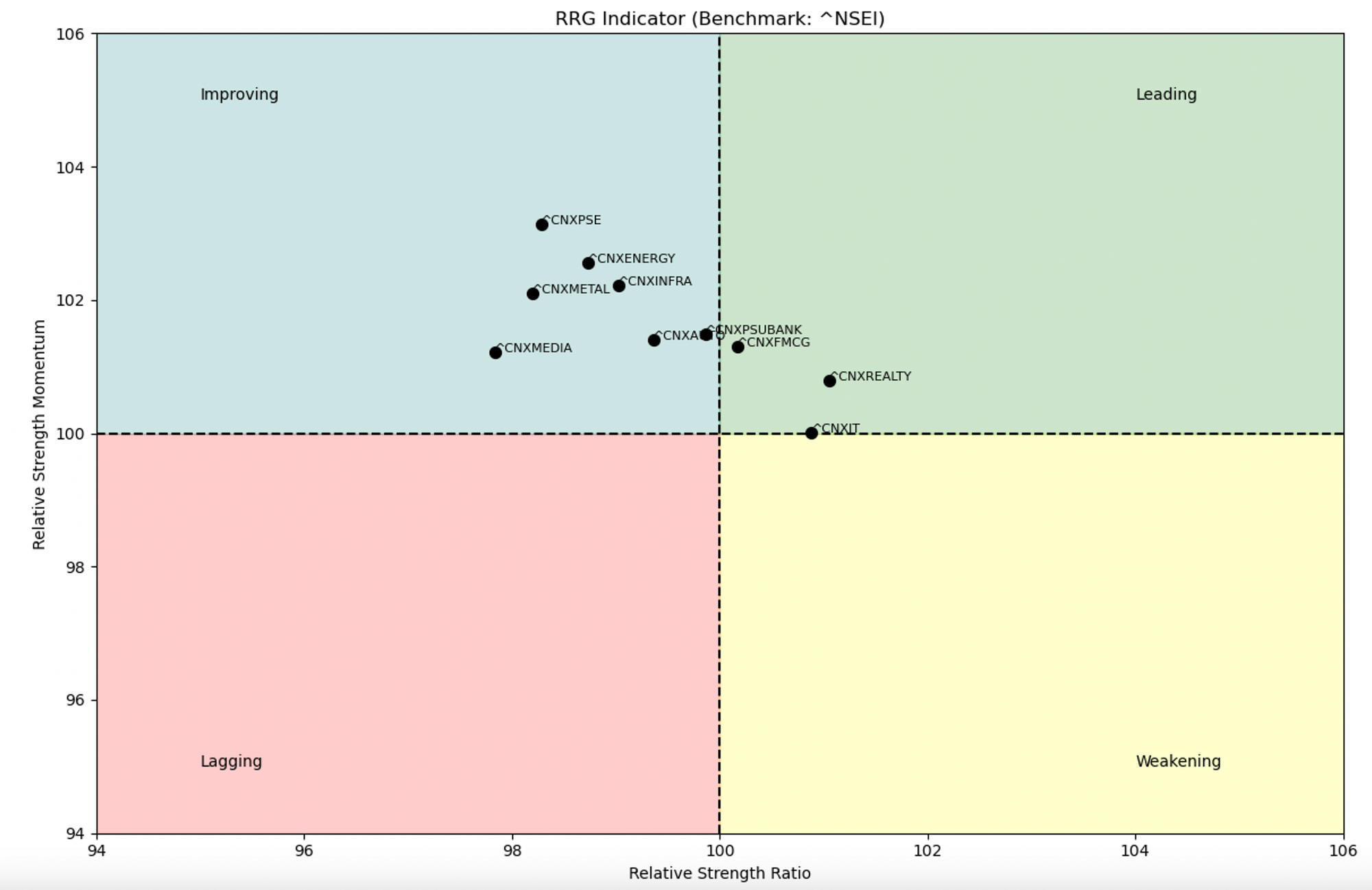
RRG plot as of 18th Jan, 2025
Breaking Down the Code
Getting the Data: We rely on the
yfinancelibrary to fetch closing prices for our sectors and the prices of the benchmark (NIFTY 50) index.Crunching the Numbers: By calculating the relative strength and smoothing it, we create the RS-Ratio. Comparing the RS-Ratio to its past value, we get the RS-Momentum. In the code snippet, I have used a lookback period of 55 days which basically is equivalent of roughly one quarter of trading days. You can play around with different lookback periods based on your preference.
Creating the Chart: Each sector’s story is brought to life on a 2D graph, complete with colourful scatter points and quadrants to guide our analysis.
What Can We Learn?
By plotting these RRG ratios, we can:
Spot which sectors are leading the pack.
Identify sectors that might soon fade into the background.
Uncover hidden gems quietly gaining momentum.
With a tool like this, you’re no longer running blind. Instead, you’re armed with a GPS like tool for the stock market.
Conclusion
RRGs are like storytelling tools for investors, showing how different sectors evolve over time. With Python, the process of creating and interpreting these graphs becomes not just accessible but also fun. So, what are you waiting for? Try this out on your favourite sectors and see what stories the market is trying to tell you!