
In partnership with

Apple's New Smart Display Confirms What This Startup Knew All Along

Apple has entered the smart home race with its new Smart Display, firing a $158B signal that connected homes are the future.
When Apple moves in, it doesn’t just join the market — it transforms it.
One company has been quietly preparing for this moment.
Their smart shade technology already works across every major platform, perfectly positioned to capture the wave of new consumers Apple will bring.
While others scramble to catch up, this startup is already shifting production from China to its new facility in the Philippines — built for speed and ready to meet surging demand as Apple’s marketing machine drives mass adoption.
With 200% year-over-year growth and distribution in over 120 Best Buy locations, this company isn’t just ready for Apple’s push — they’re set to thrive from it.
Shares in this tech company are open at just $1.90.
Apple’s move is accelerating the entire sector. Don’t miss this window.
Past performance is not indicative of future results. Email may contain forward-looking statements. See US Offering for details. Informational purposes only.
🚀 Your Investing Journey Just Got Better: Premium Subscriptions Are Here! 🚀
It’s been 4 months since we launched our premium subscription plans at GuruFinance Insights, and the results have been phenomenal! Now, we’re making it even better for you to take your investing game to the next level. Whether you’re just starting out or you’re a seasoned trader, our updated plans are designed to give you the tools, insights, and support you need to succeed.
Here’s what you’ll get as a premium member:
Exclusive Trading Strategies: Unlock proven methods to maximize your returns.
In-Depth Research Analysis: Stay ahead with insights from the latest market trends.
Ad-Free Experience: Focus on what matters most—your investments.
Monthly AMA Sessions: Get your questions answered by top industry experts.
Coding Tutorials: Learn how to automate your trading strategies like a pro.
Masterclasses & One-on-One Consultations: Elevate your skills with personalized guidance.
Our three tailored plans—Starter Investor, Pro Trader, and Elite Investor—are designed to fit your unique needs and goals. Whether you’re looking for foundational tools or advanced strategies, we’ve got you covered.
Don’t wait any longer to transform your investment strategy. The last 4 months have shown just how powerful these tools can be—now it’s your turn to experience the difference.

This is how we can enhance stock picking with Python
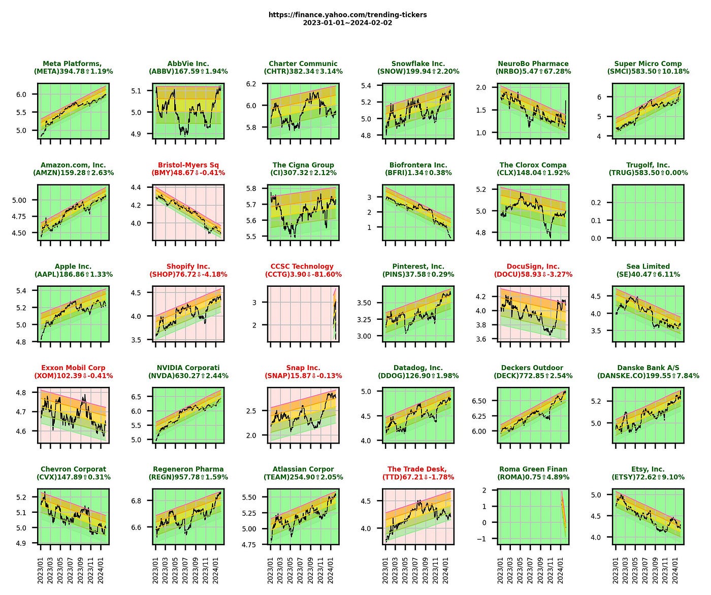
chart generated by aurthor with yahoo finance data
I received very good feedback on my recent post using Logarithmic Regression to spot stock trends.
Let’s see how we can use Python to help removing the noise from the market as there are different “top picks” everyday, in order to not fall into a “pure hype with no potential gain” pitfall, while we are reading what is trending, we should be able to also identfy which trend can sustain, which is near the peak, and which has high potential to become the next rising star.
Pay No Interest Until Nearly 2027 AND Earn 5% Cash Back
Use a 0% intro APR card to pay off debt.
Transfer your balance and avoid interest charges.
This top card offers 0% APR into 2027 + 5% cash back!
Reading the Yahoo Screener page
I like to quickly glance in the morning the Yahoo Finance’s Top most active stock list. What I was trying to look for are:
what kind of sector the market (technology, enegery, retail, etc) is trending today
what kind of asset (Crypto, Currency, Stock, ETF, etc) people are searching most today
what stock / ticker has news that I might have missed hence the stock appears in this list today
I highlighted today in every sentence as it is really a short term market sentiment that people are chasing, today. It may or may not have a longer term future. Maybe these are just noise.
This is what you will get when you are reading the yahoo (US) Most Active screener above:

You need to click into each stock and read the chart before you can get a feeling the trend of the stock in a longer time frame.
I am lazy to do it one by one, so I write a chartting python program just to help me visulize “where we are” with the stocks under this screener.
The stock screener
First as usual, let’s import all necessary modules, I think I don’t need to further explain as these are the usual suspects :
import pandas as pd # Dataframe
from datetime import datetime # Date conversion
import math # some algo required
import requests # to help scrapping yahoo webpage
import numpy as np # some calculation and nan value checking

from bs4 import BeautifulSoup # for scrapping and interpret web scrap result
import matplotlib.pyplot as plt # plotting of charts
import matplotlib.dates as mdates
from matplotlib.dates import DateFormatter

import yfinance as yf # download yahoo finance data
Scrapping the Yahoo page
I want the program to scrap the yahoo screener page so I use this routine which I have introduced in my another article about intrinsic value calculation:
def read_html_table(source):
    header = {'User-Agent': 'Mozilla/5.0 (Windows NT 10.0; Win64; x64) AppleWebKit/537.36 (KHTML, like Gecko) Chrome/71.0.3578.98 Safari/537.36 '}

    res = requests.get(source,headers=header, timeout=20)

    if res.status_code != 200:
        res = requests.get(source,headers=header, timeout=20) #try 1 more time
        return None, res.status_code, res.text

    # soup = BeautifulSoup(res.content, "lxml")
    soup = BeautifulSoup(res.content, "html.parser")

    if 'Select All' in res.text:
        for tag in soup.find_all("span", {'class':'Fz(0)'}): #remove those select checkboxes if any
            tag.replaceWith('')

    table = soup.find_all('table')
    if len(table)==0:
        print ('something very wrong!')
        return None

    # return symbol list
    df = pd.read_html(str(table))[0]
    df['Symbol']=df['Symbol'].str.split().str[0] # adjust according to Yahoo table format and extract the symbols ONLY not with company name
    return df
We then need a main routine to read the symbol of Most Active stocks from the above page, and download one by one each stock’s historical data and plot it into chart.
I use Matplotlib module to plot the chart and with some matrix arrangement, I try to plot the subplots in a NxN grid as below.
The input of this routine is
link : the Yahoo screener link just like above. You can provide any Yahoo screener link as the layout of the webpage is the same.
startdate: I would like to further look back into months, years, decade of how this stock perform, so I use the argument to give me flexibility when retreiving stock historical data
For easy visulization, I used red and green colour to indicate as chart background of each stock whether it has up or down from yesterday.
You can simply tweet it and modify the conditional statement
“if (pct_change>=0):”
to some other algorithm that you are working on, so that the colour can indicate a BUY or SELL signal. We should always make our lives easier, no?
def stock_screener(link,startdate):

    symbol_list =read_html_table(link)

    if symbol_list.empty:
        raise RuntimeError('yahoo trending-tickers error')

    figrow=math.ceil(math.sqrt(len(symbol_list)))
    figcol=math.ceil(math.sqrt(len(symbol_list)))
    if figrow*figcol-len(symbol_list) >= figrow: # find the best fit square array of charts
        figrow-=1

    dynamic_dpi = min(figrow * figcol * 10, 1200)
    dynamic_fontsize = max(8-figcol,4) #max(100/(figcol*figrow),5)

    # prepare the chart
    fig, axes = plt.subplots(figrow,figcol, figsize=(figcol, figrow), dpi=600, squeeze=False, sharey=False,sharex='col')


    # Read finance data from Yahoo

    all_stock_data=yf.download(symbol_list.Symbol.to_list(),start=startdate,interval='1d')
    set(all_stock_data.columns.get_level_values(0))
    all_stock_data=all_stock_data.reset_index()

    for i,s in enumerate(symbol_list.Symbol): # iterate for every stock indices

        tickerDf=pd.DataFrame()
        ax = axes[int(i%figrow),int(i/figrow)]

        tickerDf['Date']=all_stock_data['Date']
        tickerDf['Close']=all_stock_data['Close'][s]

        """                                           """
        """ +------- SUBPLOT each symbol chart -----+ """
        """                                           """
        company_name_len=16

        title_name=(symbol_list[symbol_list['Symbol']==s].iloc[0])['Name']
        title_name=title_name[:company_name_len]

        titlecolor='black'
        facecolor='white'

        # Plot stock chart
        ax.plot(tickerDf['Date'],tickerDf['Close'],color='black',linewidth=0.6, alpha=1)

        pct_change=0

        # Here we try to use background color to indicate stock changes
        if len(tickerDf)>3 : # try to avoid new stock with less than 3 days of data
            if math.isnan(tickerDf['Close'].iloc[-1]): #sometimes yahoo returns current date data as NaN as the market hasn't open
                current_price=tickerDf['Close'].iloc[-2] #tickerinfoData.get('ask')
                previous_price=tickerDf['Close'].iloc[-3]
            else:
                current_price=tickerDf['Close'].iloc[-1] #tickerinfoData.get('ask')
                previous_price=tickerDf['Close'].iloc[-2]

            pct_change=((current_price-previous_price)/previous_price)*100

        # Colour condition #
        if (pct_change>=0): # change background colour depends on % change
            todaytrendsymbol='⇧'
            titlecolor='darkgreen'
            facecolor='palegreen'
        else:
            todaytrendsymbol='⇩'
            titlecolor='red'
            facecolor='mistyrose'


        # use facecolor to indicate Up/Down for easy visualization
        ax.patch.set_facecolor(facecolor)
        # let's beautify the chart a bit
        ax.grid(True, color='silver',linewidth=0.5)
        ax.tick_params(axis='x',labelrotation=90)
        ax.xaxis.set_major_formatter(mdates.DateFormatter('%Y/%m'))
        ax.xaxis.set_tick_params(labelsize=dynamic_fontsize)
        ax.yaxis.set_tick_params(labelsize=dynamic_fontsize)

        # Finally, add a title to the figure
        title=title_name+'\n('+s+')'+\
            str('%.2f'%current_price)+\
            todaytrendsymbol+str('%.2f'%pct_change)+'%'
        ax.set_title(title, fontweight='bold',color=titlecolor,fontsize=dynamic_fontsize)

        if (i==0): # at each bottom row set the xaxis as date tick
            for j in range(len(symbol_list),int(figrow*figcol)):
                ax = axes[ int(j%figrow),int(j/figrow)]
                ax.tick_params(axis='x',labelrotation=90)
                ax.xaxis.set_major_formatter(mdates.DateFormatter('%Y/%m'))
                ax.xaxis.set_tick_params(labelsize=dynamic_fontsize)
                ax.yaxis.set_tick_params(labelsize=dynamic_fontsize)

    plt.subplots_adjust(wspace=0.12, hspace=0.1)

    today=datetime.now().strftime("%Y-%m-%d")
    fig.suptitle(link+'\n'+startdate+'~'+today, fontweight ="bold",y=1, fontsize=dynamic_fontsize)
    fig.tight_layout()
    fig.savefig('/Users/user/Downloads/stock_screener.jpg',dpi=400,bbox_inches='tight')

    return True
If now we call this routine with below, you will have the following chart.
if __name__ == '__main__':
    url='https://finance.yahoo.com/trending-tickers'
    stock_screener(url,startdate='2023-01-01')
Viola!!!! Isn’t this beautiful and easy? Below are the result of 02–02–2024 pre-market.
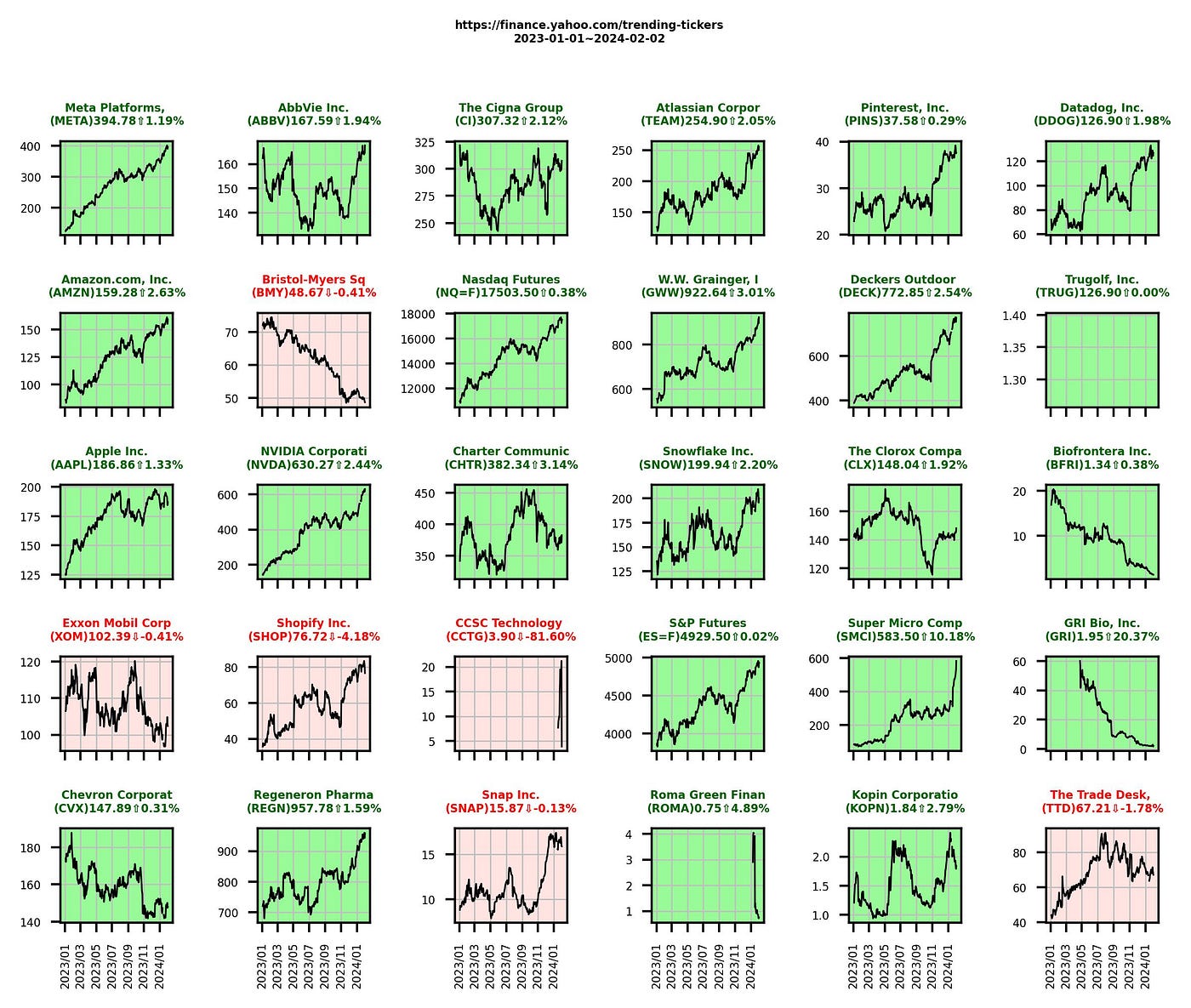
What are we reading?
We see from above charts, many stocks are on the rise from yesterday. META has after-market rise even over 15% as of 02–02–2024!
The market is still very hot and very technology focus, maybe “too focus” in technology mainly.
Shall I follow the crowd? Is there still room before the Big Crash that everyone has been talking about? Looking at the above charts we can deduce the market sentiment is still on positive side. The problem is always about timing.
Applying analysis to the chart
We can simply change or add to the above chart our indicators to help us see through the price alone.
If I simply change the line :
        # Plot stock chart
        ax.plot(tickerDf['Date'],tickerDf['Close'],color='black',linewidth=0.6, alpha=1)
to plot using the Logarithmic Regression mentioned previously, at least for me, I have a better understanding of where the stock price is and how far can it go from here.
        # Plot Logarithmic Regression instead
        tickerDf=Logarithmic_regression(tickerDf)
        ax=plot_chart(ax, tickerDf)
The Logarithmic_regression() routine is the same as before in my previous article, but let me copy it here as well:
def Logarithmic_regression(df):
    df = df[df['Close'].notna()]
    df['price_y']=np.log(df['Close']) # using natural log of stock price

    df['x']=np.arange(len(df)) #fill index x column with 1,2,3...n
    try:
        b,a =np.polyfit(df['x'],df['price_y'],1)
    except Exception as e:   # to handle nan value if any
        b,a=0,0

    df['priceTL']=b*df['x'] + a

    df['y-TL']=df['price_y']-df['priceTL']
    df['SD']=np.std(df['y-TL'])
    df['TL-2SD']=df['priceTL']-2*df['SD']
    df['TL-SD']=df['priceTL']-df['SD']
    df['TL+2SD']=df['priceTL']+2*df['SD']
    df['TL+SD']=df['priceTL']+df['SD']

    return df
The plot_chart () routine will take 2 arguments:
ax — the subplot we are plotting so that it can plot of the exact subplot we are working on for each stock
df — the dataframe of the stock price including the Logarithmic_regression data for us to plot the corridors
it returns the ax after finish plotting the chart so that the main routine can carry on with any beautification or to add more indicators.
def plot_chart(ax,df):

    RAINBOWCOLOR1='hotpink'
    RAINBOWCOLOR2='orange'
    RAINBOWCOLOR3='gold'
    RAINBOWCOLOR4='yellowgreen'
    RAINBOWCOLOR5='lightgreen'

    # plotting stock price on log regression
    ax.plot(df['Date'],df['price_y'],color='black',linewidth=0.5)

    # plotting stock price on log regression
    ax.plot(df['Date'],df['TL+2SD'],color=RAINBOWCOLOR1, linewidth=0.5)
    ax.plot(df['Date'],df['TL+SD'],color=RAINBOWCOLOR2,  linewidth=0.5)
    ax.plot(df['Date'],df['priceTL'],color=RAINBOWCOLOR3,linewidth=0.5)
    ax.plot(df['Date'],df['TL-SD'], color=RAINBOWCOLOR4, linewidth=0.5)
    ax.plot(df['Date'],df['TL-2SD'],color=RAINBOWCOLOR5, linewidth=0.5)


    ax.fill_between(df['Date'],df['TL+2SD'], df['TL+SD'],facecolor=RAINBOWCOLOR2,  alpha=0.6,edgecolor=None,linewidth=0)
    ax.fill_between(df['Date'],df['TL+SD'], df['priceTL'],facecolor=RAINBOWCOLOR3, alpha=0.6,edgecolor=None,linewidth=0)
    ax.fill_between(df['Date'],df['priceTL'], df['TL-SD'],facecolor=RAINBOWCOLOR4, alpha=0.6,edgecolor=None,linewidth=0)
    ax.fill_between(df['Date'],df['TL-SD'], df['TL-2SD'],facecolor=RAINBOWCOLOR5,  alpha=0.6,edgecolor=None,linewidth=0)

    return ax
If we run again, here is the result with the same Yahoo screener stock list, but indicated in the Logarithmic regression way.
What I first notice is despite most stock has green indication that it has been risen from yesterday, not all have a uptrend.
These charts do not only give me a better visibility of the trend, but where we are with this trend : be it at the bottom of a rising trend or approaching the top of the corridor in each rainbow Logarithmic Regression indicator which I am expecting the continuation of the firework on one side and need to enter with extra cautious and not get burnt on the other.
Despite META (same as AMAZON) has a surprising surge from yesterday, the indicator is telling me $398 is just at the beginning (lower half of corridor — before the double digit% surge)!!! Please note the price / chart here is showing yesterday close which is before the 15% rise which happened after market on 01 – 02 – 2024.
Disclaimer: I need more study to confirm this uptake is just a beginning, but at least I will look into Facebook’s technical and fundamental before any buying decision if I want to enter into trade today. But at least it gives me one good sign.
For those which are at peak of its corridor, it has the momentum but also a high risk it might turn back down pretty quick. Not for average investor to enter.
Applying other indicator and algo-trade is easy!
Simply change the codes to reflect your indicator will do.
Let me give you one example if to include Exponential Moving Average indiciator in the chart:
def trading_inidicator(ax, df):
    df['ema1'] = df['Close'].ewm(span=30, adjust=False).mean()
    df['ema2'] = df['Close'].ewm(span=80, adjust=False).mean()
    df['ema3'] = df['Close'].ewm(span=100, adjust=False).mean()
    df['ema4'] = df['Close'].ewm(span=200, adjust=False).mean()

    ax.plot(df['Date'],df['ema1'],color='orange',linewidth=0.6, alpha=1)
    ax.plot(df['Date'],df['ema2'],color='blue',linewidth=0.6, alpha=1)
    ax.plot(df['Date'],df['ema3'],color='violet',linewidth=0.6, alpha=1)
    ax.plot(df['Date'],df['ema4'],color='red',linewidth=0.6, alpha=1)

    return ax
and change back the main routine to plot the trading indicator, I commented out the previous Log Regression plesae note.
        # Plot stock chart
        ax.plot(tickerDf['Date'],tickerDf['Close'],color='black',linewidth=0.6, alpha=1)

        """ Your trading analysis and Plot here """
        # tickerDf=Logarithmic_regression(tickerDf)
        # ax=plot_chart(ax, tickerDf)
        ax=trading_inidicator(ax, tickerDf)
This is what you will have as a result with EMA 30, 80, 100, 200 days. Isn’t this much better than reading the yahoo stock list only?
