Your daily edge in private markets
Wondering what’s the latest with crypto treasury companies, Pre-IPO venture secondaries, private credit deals and real estate moves? Join 100,000+ private market investors who get smarter every day with Alternative Investing Report, the industry's leading source for investing in alternative assets.
In your inbox by 9 AM ET, AIR is chock full of the latest insights, analysis and trends that are driving alts. Readers get a weekly investment pick to consider from a notable investor, plus special offers to join top private market platforms and managers.
And the best part? It’s totally free forever.
🚀 Your Investing Journey Just Got Better: Premium Subscriptions Are Here! 🚀
It’s been 4 months since we launched our premium subscription plans at GuruFinance Insights, and the results have been phenomenal! Now, we’re making it even better for you to take your investing game to the next level. Whether you’re just starting out or you’re a seasoned trader, our updated plans are designed to give you the tools, insights, and support you need to succeed.
Here’s what you’ll get as a premium member:
Exclusive Trading Strategies: Unlock proven methods to maximize your returns.
In-Depth Research Analysis: Stay ahead with insights from the latest market trends.
Ad-Free Experience: Focus on what matters most—your investments.
Monthly AMA Sessions: Get your questions answered by top industry experts.
Coding Tutorials: Learn how to automate your trading strategies like a pro.
Masterclasses & One-on-One Consultations: Elevate your skills with personalized guidance.
Our three tailored plans—Starter Investor, Pro Trader, and Elite Investor—are designed to fit your unique needs and goals. Whether you’re looking for foundational tools or advanced strategies, we’ve got you covered.
Don’t wait any longer to transform your investment strategy. The last 4 months have shown just how powerful these tools can be—now it’s your turn to experience the difference.
Apple (AAPL) Stock Price Ichimoku Cloud
Why Ichimoku Cloud?
If you’re new to trading, one problem is knowing when to enter or exit a position.
The Ichimoku Cloud simplifies that decision by combining multiple indicators into one clear visual system.
The Ichimoku Cloud is one of the most fascinating indicators I’ve explored. Unlike standard indicators, it gives a full picture of trend, momentum, and potential support/resistance zones, all in one glance.
In this article, we’re going to build the Ichimoku Cloud strategy from scratch using Python. We’ll go through:
Pulling historical price data
Calculating the Ichimoku components
Visualizing the cloud and signals
Backtesting a simple strategy
Evaluating performance with equity curves and drawdowns
Everything is explained step by step so that even if you’ve never coded before, you’ll follow along.
Your Boss Will Think You’re an Ecom Genius
You’re optimizing for growth. Go-to-Millions is Ari Murray’s ecommerce newsletter packed with proven tactics, creative that converts, and real operator insights—from product strategy to paid media. No mushy strategy. Just what’s working. Subscribe free for weekly ideas that drive revenue.
1. Install and Import Required Libraries
Before we start, we need a few libraries:
yfinanceto download historical stock datapandasfor calculationsmatplotlibfor visualizationstabulateto display backtest stats nicely
Here’s how we set that up:
%pip install yfinance matplotlib tabulate -qNext, import the libraries:
import yfinance as yf
import pandas as pd
import matplotlib.pyplot as plt
from tabulate import tabulate
2. Download Historical Price Data
We need historical stock prices to test the strategy. Here we use Apple (AAPL) as an example:
# Download historical stock data
symbol = "AAPL"  # You can change to BTC-USD, TSLA, etc.
data = yf.download(symbol, start="2020-01-01", end="2024-12-31")

# Select the desired columns (first level of MultiIndex)
data.columns = data.columns.get_level_values(0)

data.head()Interpretation:
We’ve pulled Open, High, Low, Close, and Volume for Apple over 2020–2024. This gives us the raw data we need to calculate the Ichimoku components.
The best marketing ideas come from marketers who live it. That’s what The Marketing Millennials delivers: real insights, fresh takes, and no fluff. Written by Daniel Murray, a marketer who knows what works, this newsletter cuts through the noise so you can stop guessing and start winning. Subscribe and level up your marketing game.
3. Visualize Closing Price
Before adding the indicator, let’s see how the stock price moved:
# Plot closing price only
plt.figure(figsize=(14,6))
plt.plot(data.index, data['Close'], label=f"{symbol} Closing Price", color="black", linewidth=1.5)
plt.title(f"{symbol} Closing Price (2020-2024)")
plt.xlabel("Date")
plt.ylabel("Price")
plt.legend()
plt.savefig(f"figures/{symbol}_closing_price.png", dpi=300)
plt.show()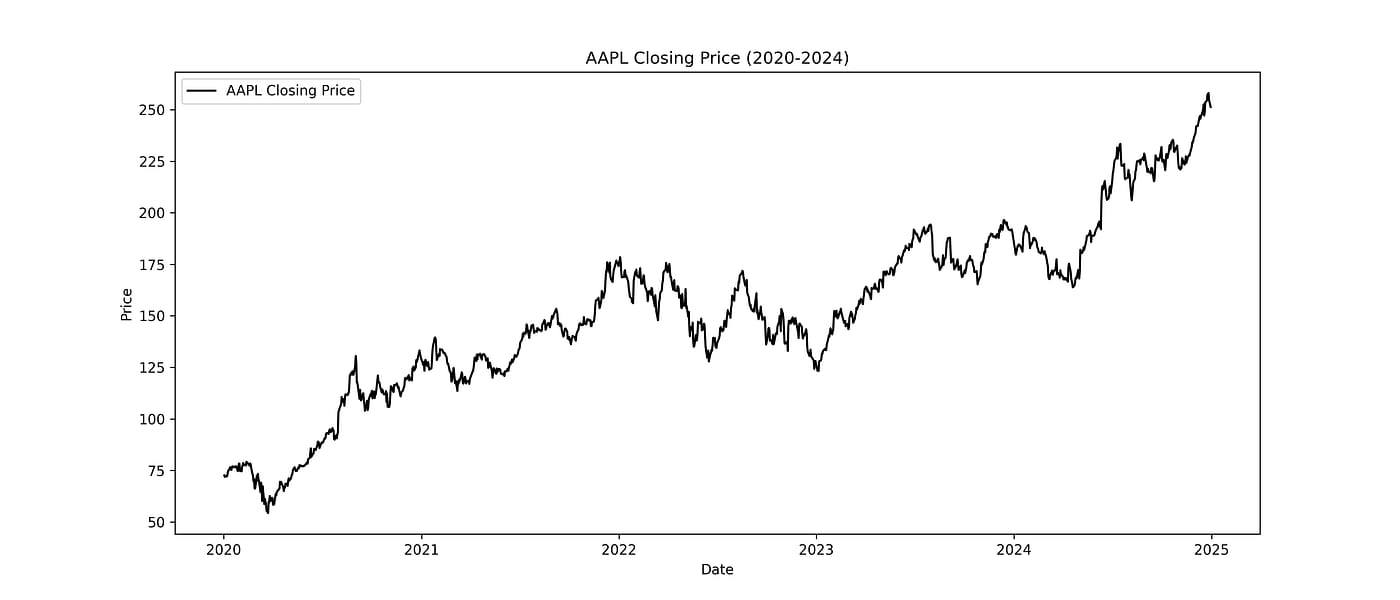
Apple’s Closing Price from 2020–2024
Interpretation:
This plot gives a simple view of price history. Seeing the price movement helps contextualize the Ichimoku Cloud when we overlay it later.
4. Calculate Ichimoku Components
The Ichimoku Cloud is made up of five lines:
Tenkan-sen
Kijun-sen
Senkou Span A
Senkou Span B
Chikou Span
Here’s how we calculate them:
# Ichimoku settings (standard: 9, 26, 52)
high = data['High']
low = data['Low']
close = data['Close']

# Tenkan-sen (Conversion Line): (9-period high + 9-period low) / 2
data['tenkan'] = (high.rolling(9).max() + low.rolling(9).min()) / 2

# Kijun-sen (Base Line): (26-period high + 26-period low) / 2
data['kijun'] = (high.rolling(26).max() + low.rolling(26).min()) / 2

# Senkou Span A (Leading Span A): (tenkan + kijun) / 2, shifted 26 periods forward
data['senkou_a'] = ((data['tenkan'] + data['kijun']) / 2).shift(26)

# Senkou Span B (Leading Span B): (52-period high + 52-period low) / 2, shifted 26 periods forward
data['senkou_b'] = ((high.rolling(52).max() + low.rolling(52).min()) / 2).shift(26)

# Chikou Span (Lagging Span): closing price shifted -26 periods
data['chikou'] = close.shift(-26)Interpretation:
Tenkan-sen: short-term trend
Kijun-sen: medium-term trend
Senkou A & B: define the cloud (Kumo)
Chikou: confirms momentum
This calculation sets up the foundation for both visualization and strategy signals.
5. Visualize the Ichimoku Cloud
Now let’s overlay the lines and cloud on the price chart:
plt.figure(figsize=(14,8))
plt.plot(data.index, data['Close'], label="Close", color='black', linewidth=1)

# Tenkan & Kijun
plt.plot(data.index, data['tenkan'], label="Tenkan (Conversion)", color='blue', linewidth=1.2)
plt.plot(data.index, data['kijun'], label="Kijun (Base)", color='red', linewidth=1.2)

# Cloud area
plt.fill_between(
    data.index, data['senkou_a'], data['senkou_b'],
    where=data['senkou_a'] >= data['senkou_b'],
    color='lightgreen', alpha=0.4
)
plt.fill_between(
    data.index, data['senkou_a'], data['senkou_b'],
    where=data['senkou_a'] < data['senkou_b'],
    color='lightcoral', alpha=0.4
)

# Chikou
plt.plot(data.index, data['chikou'], label="Chikou (Lagging)", color='green', linestyle='dotted')

plt.title(f"{symbol} Ichimoku Cloud")
plt.legend(loc="upper left")
plt.savefig(f"figures/{symbol}_ichimoku_cloud.png", dpi=300)
plt.show()
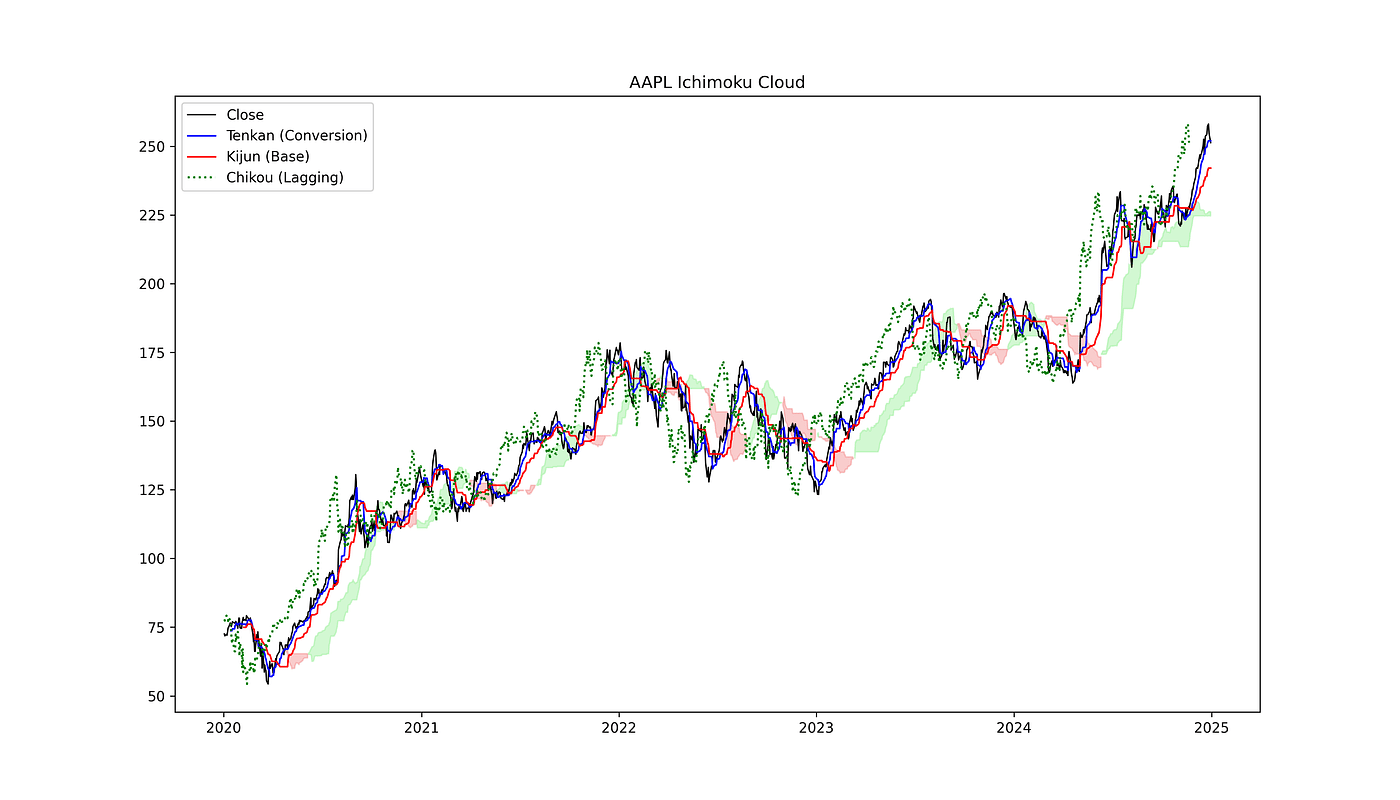
AAPL Ichimoku Cloud
Interpretation:
Green cloud = bullish
Red cloud = bearish
Tenkan/Kijun crossovers hint at potential trades
Chikou shows momentum
6. Define a Simple Trading Strategy
We’ll generate buy signals when the price closes above the cloud and Tenkan crosses above Kijun:
# Strategy: Buy when price closes above cloud and Tenkan crosses above Kijun
data['above_cloud'] = data['Close'] > data[['senkou_a', 'senkou_b']].max(axis=1)
data['tenkan_cross'] = (data['tenkan'] > data['kijun']) & (data['tenkan'].shift(1) <= data['kijun'].shift(1))

data['signal'] = 0
data.loc[data['above_cloud'] & data['tenkan_cross'], 'signal'] = 1 # Buy signalInterpretation:
This creates a simple, rule-based signal. Only buy when both conditions are met. No sells yet, we’ll define them next.
7. Visualize Trade Signals
We identify trades as buy → sell pairs and plot them with the cloud:
# Find trades: buy → sell pairs
buy_points = []
sell_points = []
position = 0  # 0 = flat, 1 = long

for i in range(len(data)):
    if data['signal'].iloc[i] == 1 and position == 0:
        buy_points.append((data.index[i], data['Close'].iloc[i]))
        position = 1
    elif position == 1 and data['Close'].iloc[i] < data[['senkou_a','senkou_b']].min(axis=1).iloc[i]:
        sell_points.append((data.index[i], data['Close'].iloc[i]))
        position = 0

# Convert to DataFrames for plotting
buy_df = pd.DataFrame(buy_points, columns=["Date","Price"]).set_index("Date")
sell_df = pd.DataFrame(sell_points, columns=["Date","Price"]).set_index("Date")

# Plot with clean trade-based signals
plt.figure(figsize=(14,8))
plt.plot(data.index, data['Close'], color='black', linewidth=1, label="Close")

plt.scatter(buy_df.index, buy_df['Price'], marker="^", color="green", s=100, label="Buy Signal")
plt.scatter(sell_df.index, sell_df['Price'], marker="v", color="red", s=100, label="Sell Signal")

# Cloud
plt.fill_between(
    data.index, data['senkou_a'], data['senkou_b'],
    where=data['senkou_a'] >= data['senkou_b'],
    color='lightgreen', alpha=0.4
)
plt.fill_between(
    data.index, data['senkou_a'], data['senkou_b'],
    where=data['senkou_a'] < data['senkou_b'],
    color='lightcoral', alpha=0.4
)

plt.title(f"{symbol} Ichimoku Cloud with Trade-Based Buy & Sell Signals")
plt.legend()
plt.savefig(f"figures/{symbol}_trade_signals.png", dpi=300)
plt.show()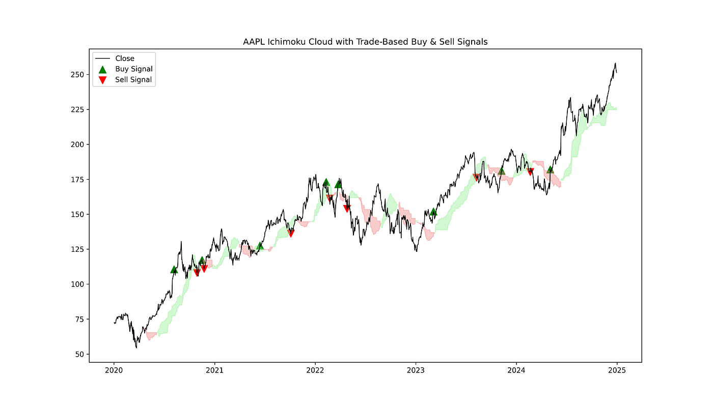
AAPL Ichimoku Cloud with Buy and Sell Signals
Interpretation:
Green arrows = buy
Red arrows = sell
Only one sell per buy
Cloud helps visualize where the price is strong or weak
8. Backtest the Strategy
We simulate a portfolio starting with $10,000:
# Backtest parameters
initial_balance = 10000
position = 0
balance = initial_balance
equity_curve = []

for i in range(len(data)):
    # Buy condition
    if data['signal'].iloc[i] == 1 and position == 0:
        position = balance / data['Close'].iloc[i]
        balance = 0

    # Sell condition: price closes below the cloud
    elif position > 0 and data['Close'].iloc[i] < data[['senkou_a', 'senkou_b']].min(axis=1).iloc[i]:
        balance = position * data['Close'].iloc[i]
        position = 0

    # Track portfolio value
    equity_curve.append(balance + position * data['Close'].iloc[i])

data['equity'] = equity_curve

# Plot equity curve
plt.figure(figsize=(14,6))
plt.plot(data.index, data['equity'], label="Equity Curve", color="blue")
plt.title("Equity Curve of Ichimoku Strategy")
plt.legend()
plt.savefig(f"figures/{symbol}_equity_curve.png", dpi=300)
plt.show()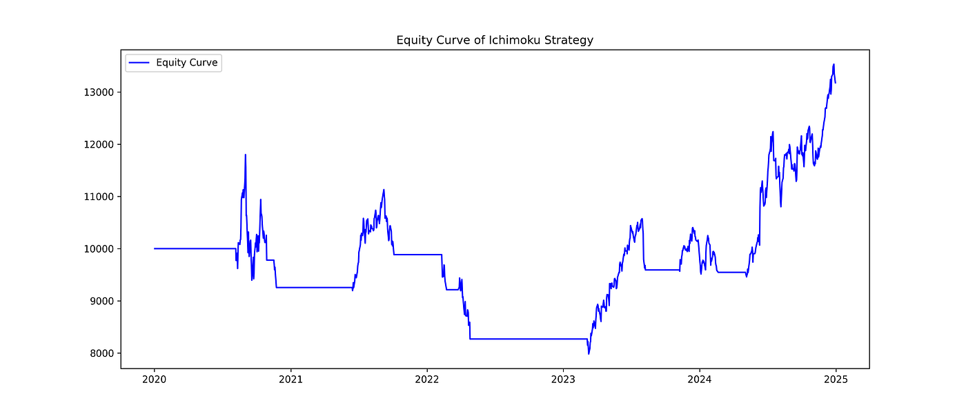
AAPL Equity Curve of Ichimoku Strategy
9. Evaluate Backtest Performance
Now that we have simulated the strategy, let’s calculate key performance metrics to see how it actually performed:
final_balance = data['equity'].iloc[-1]
total_return = (final_balance - initial_balance) / initial_balance * 100
max_equity = data['equity'].cummax()
drawdown = (data['equity'] - max_equity) / max_equity
max_drawdown = drawdown.min() * 100

stats = [
    ["Initial Balance", f"${initial_balance:,.2f}"],
    ["Final Balance", f"${final_balance:,.2f}"],
    ["Total Return", f"{total_return:.2f}%"],
    ["Max Drawdown", f"{max_drawdown:.2f}%"],
]

print(tabulate(stats, headers=["Metric", "Value"], tablefmt="github"))Output:
╭─────────────────┬────────────╮
│ Metric          │ Value      │
├─────────────────┼────────────┤
│ Initial Balance │ $10,000.00 │
│ Final Balance   │ $13,177.42 │
│ Total Return    │ 31.77%     │
│ Max Drawdown    │ -32.36%    │
╰─────────────────┴────────────╯
Interpretation of Results
Initial vs. Final Balance: Starting with $10,000, the strategy grew the portfolio to $13,177, giving a total return of 31.77% over the 5-year period. That’s a solid gain for a rule-based, unoptimized strategy.
Max Drawdown: The maximum drawdown of -32.36% tells us the largest peak-to-trough loss during this period. Drawdowns are important because they show the risk of losing money at the worst point, even if the final return looks good.
Equity Curve Observation: By looking at the equity curve, you can see that the strategy captures upward trends but also experiences significant drops during downtrends. This is normal for trend-following strategies like Ichimoku.
10. Visualize Drawdowns
To get a better sense of the risk periods, we can visualize the drawdowns over time:
# Calculate drawdown
max_equity = data['equity'].cummax()              # Running peak
drawdown = (data['equity'] - max_equity) / max_equity  # % drop from peak

# Plot drawdown
plt.figure(figsize=(14,6))
plt.fill_between(data.index, drawdown, 0, color='red', alpha=0.4)
plt.title(f"{symbol} Drawdown Over Time")
plt.ylabel("Drawdown (%)")
plt.xlabel("Date")
plt.gca().yaxis.set_major_formatter(plt.FuncFormatter(lambda y, _: f"{y*100:.0f}%"))
plt.savefig(f"figures/{symbol}_drawdown.png", dpi=300)
plt.show()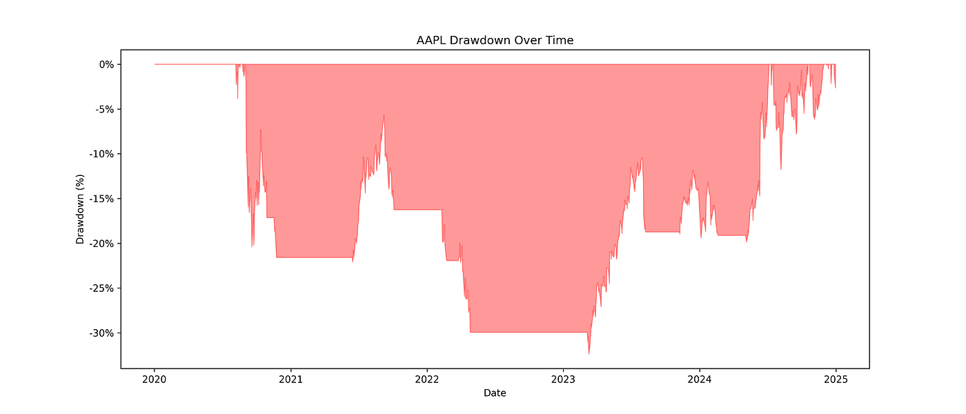
Drawdown Over Time
Interpretation:
The red areas show periods where the portfolio was below its previous peak. This highlights the strategy’s volatility, an important factor for any trader to consider.
11. Highlight Maximum Drawdown on Equity Curve
For an even clearer view, we can mark exactly where the largest loss occurred:
# Calculate running peak and drawdown
peak = data['equity'].cummax()
drawdown = (data['equity'] - peak) / peak

# Find max drawdown
max_dd_idx = drawdown.idxmin()               # Date of max drawdown
peak_before_dd_idx = data['equity'][:max_dd_idx].idxmax()  # Peak before drawdown
max_dd_value = drawdown.min() * 100

# Plot equity curve
plt.figure(figsize=(14,6))
plt.plot(data.index, data['equity'], label="Equity Curve", color="blue")

# Highlight peak before max drawdown
plt.scatter(peak_before_dd_idx, data['equity'][peak_before_dd_idx], color="green", s=100, label="Peak before Max DD")

# Highlight trough of max drawdown
plt.scatter(max_dd_idx, data['equity'][max_dd_idx], color="red", s=100, label=f"Trough of Max DD ({max_dd_value:.2f}%)")

# Shade max drawdown area
plt.fill_between(data.index, data['equity'], peak, where=(data.index>=peak_before_dd_idx)&(data.index<=max_dd_idx), color='red', alpha=0.2)

plt.title(f"{symbol} Equity Curve with Max Drawdown Highlighted")
plt.xlabel("Date")
plt.ylabel("Equity ($)")
plt.legend()
plt.savefig(f"figures/{symbol}_max_drawdown.png", dpi=300)
plt.show()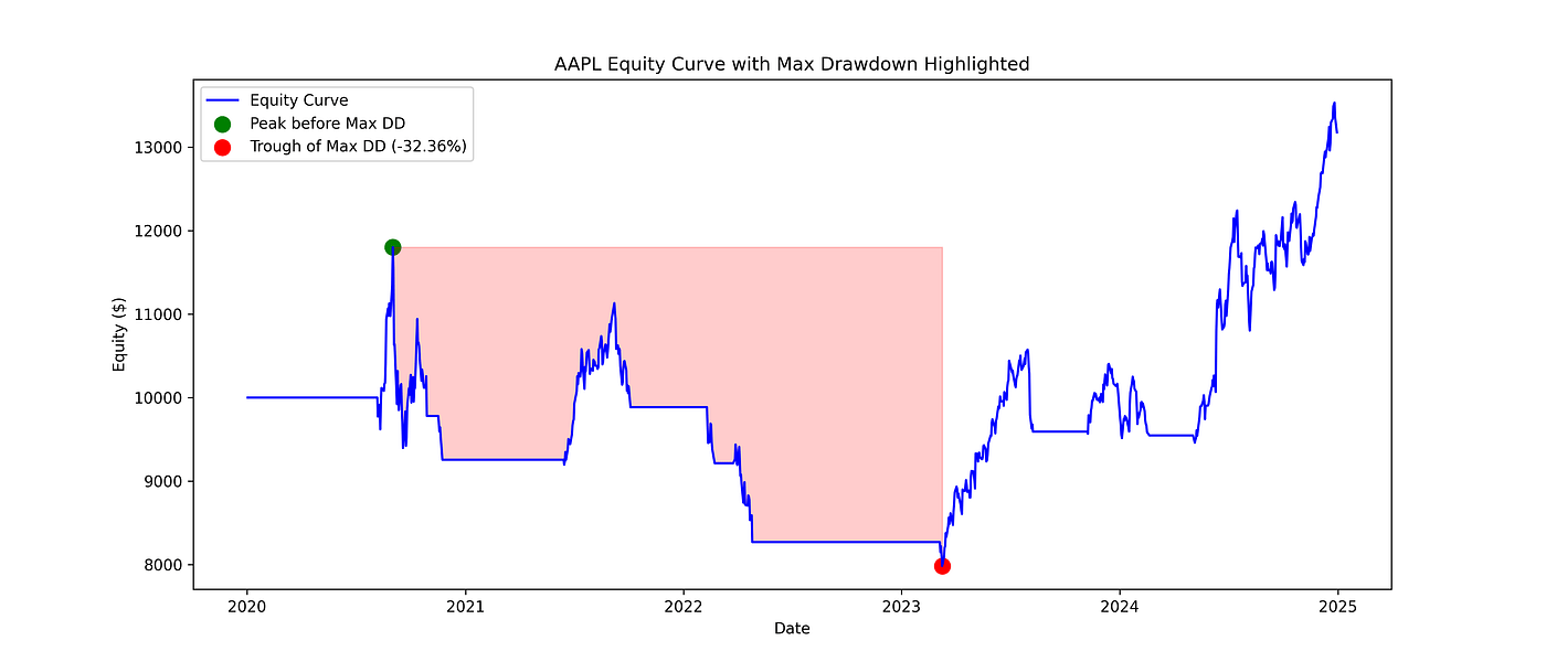
Apple’s Equity Curve with Max Drawdown
Interpretation:
Visualizing the peak-to-trough drop gives an intuitive sense of risk. Even profitable strategies can have periods where your portfolio temporarily loses a large portion of its value.
Possible Improvements and Next Steps
The strategy we implemented is simple and unoptimized, which means there’s room to improve:
Adjusting Parameters: The standard Ichimoku settings (9, 26, 52) might not be optimal for every stock or market. Tweaking these values could improve returns or reduce drawdowns.
Optimization Methods: Techniques like Bayesian Optimization or grid search can systematically test parameter combinations and identify the most effective settings for a given market.
Risk Management Enhancements: Position sizing, Stop-losses and Trailing stops can help reduce drawdowns without sacrificing gains.
Combining with Other Indicators: Using Ichimoku in combination with momentum indicators or volume analysis could filter out false signals.
What’s Next
In this guide, you learned:
How to calculate and visualize the Ichimoku Cloud in Python
How to generate buy and sell signals based on cloud and Tenkan/Kijun crosses
How to backtest a strategy with equity curves and drawdowns
How to interpret the results and understand the risk-reward tradeoff
Even with a simple, unoptimized setup, the strategy gave 31.77% returns, showing the power of a structured approach to trading.


