
Find your customers on Roku this Black Friday
As with any digital ad campaign, the important thing is to reach streaming audiences who will convert. To that end, Roku’s self-service Ads Manager stands ready with powerful segmentation and targeting options. After all, you know your customers, and we know our streaming audience.
Worried it’s too late to spin up new Black Friday creative? With Roku Ads Manager, you can easily import and augment existing creative assets from your social channels. We also have AI-assisted upscaling, so every ad is primed for CTV.
Once you’ve done this, then you can easily set up A/B tests to flight different creative variants and Black Friday offers. If you’re a Shopify brand, you can even run shoppable ads directly on-screen so viewers can purchase with just a click of their Roku remote.
Bonus: we’re gifting you $5K in ad credits when you spend your first $5K on Roku Ads Manager. Just sign up and use code GET5K. Terms apply.
🚀 Your Investing Journey Just Got Better: Premium Subscriptions Are Here! 🚀
It’s been 4 months since we launched our premium subscription plans at GuruFinance Insights, and the results have been phenomenal! Now, we’re making it even better for you to take your investing game to the next level. Whether you’re just starting out or you’re a seasoned trader, our updated plans are designed to give you the tools, insights, and support you need to succeed.
Here’s what you’ll get as a premium member:
Exclusive Trading Strategies: Unlock proven methods to maximize your returns.
In-Depth Research Analysis: Stay ahead with insights from the latest market trends.
Ad-Free Experience: Focus on what matters most—your investments.
Monthly AMA Sessions: Get your questions answered by top industry experts.
Coding Tutorials: Learn how to automate your trading strategies like a pro.
Masterclasses & One-on-One Consultations: Elevate your skills with personalized guidance.
Our three tailored plans—Starter Investor, Pro Trader, and Elite Investor—are designed to fit your unique needs and goals. Whether you’re looking for foundational tools or advanced strategies, we’ve got you covered.
Don’t wait any longer to transform your investment strategy. The last 4 months have shown just how powerful these tools can be—now it’s your turn to experience the difference.
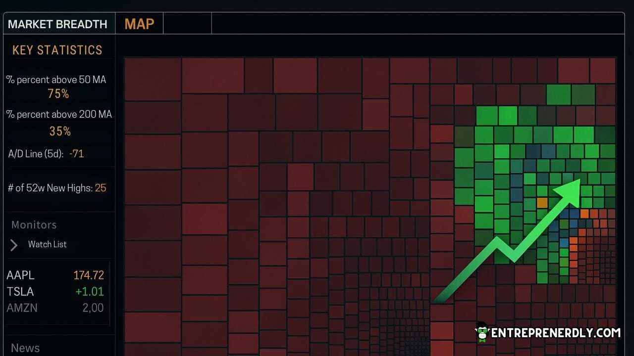
Market breadth and momentum expose changes that index price alone misses.
Divergences, advance-decline patterns, and momentum shifts in individual stocks signal turning points earlier than a benchmark index would.
These signals let you separate healthy rallies from fragile ones, and spot cracks as they widen.
Therefore, breadth and momentum statistics make the hidden risks and opportunities more visible.
This article shows how to measure S&P 500 breadth, advances and declines, and momentum percentiles using Python and free data.
The complete Python notebook for the analysis is provided below.
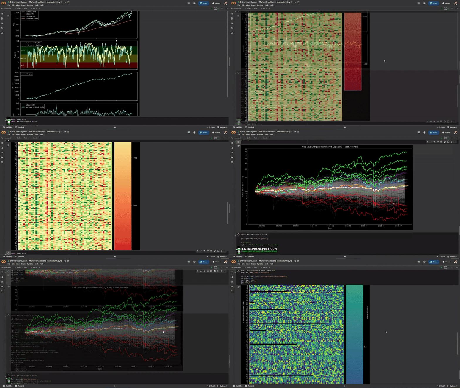
This is what we’ll cover:
Pull and clean daily price data for all S&P 500 constituents
Track price, trend, and participation signals
Visualize daily return extremes across all stocks
Compare performance for every stock
Rank stocks by momentum percentiles
1. Market Breadth and Momentum
Market breadth measures how many stocks participate in a market move.
Strong breadth means gains spread across most stocks. Weak breadth means a few heavyweights drive the index while the rest lag.
Momentum measures the tendency of stocks that outperform to keep outperforming, at least for a period.
Both signals provide context that raw index price cannot.
Why breadth matters:
Index rallies with strong breadth tend to last longer. When only a handful of stocks lead while most others stall or fall, risk rises.
Breadth reveals the difference between a healthy rally and a fragile one.
“In the long run, markets tend to move higher when a wide swath of stocks participate”
writes Ben Carlson.
“A rally driven by a few names alone is vulnerable to sharp reversals.”
Academic research supports this. Zaremba et al. (2021) find that
“breadth indicators such as the percentage of stocks above moving averages and the advance-decline line have significant predictive power for future index returns.”
Their study concludes that “Periods of declining breadth are often followed by lower risk-adjusted returns for the broader market.”
100 Genius Side Hustle Ideas
Don't wait. Sign up for The Hustle to unlock our side hustle database. Unlike generic "start a blog" advice, we've curated 100 actual business ideas with real earning potential, startup costs, and time requirements. Join 1.5M professionals getting smarter about business daily and launch your next money-making venture.
See below an example of breadth divergence ahead of a downturn.
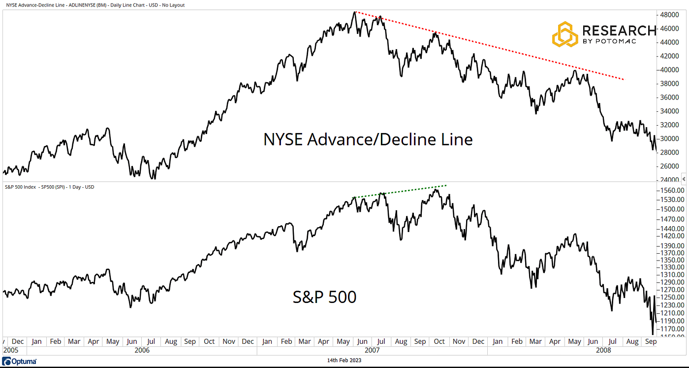
Figure 1. The NYSE Advance Decline Line diverges from the S&P 500 during 2007–2008. While the index reaches new highs, underlying participation weakens. Source: Potomac.
This pattern also played out in the S&P 500 during 2023. Despite strong index gains, participation fell sharply.
By year end, fewer than 40% of S&P 500 stocks outperformed the index, with almost all gains concentrated in the “Magnificent 7”.
The Persistence of Momentum
Momentum is among the most persistent factors in equity returns. Winners tend to keep winning over the short and medium term.
For example, stocks ranked in the top 20 percent by trailing 6-month returns have, on average, outperformed laggards over the next several months (Jegadeesh and Titman, 1993).
Breadth signals help spot market regime shifts before price confirms. Momentum measures trend persistence and expose sector rotation.
Combined, these measures catch early cracks in rallies, false breakouts, and exhaustion in crowded trades.
2. Download S&P 500 Price Data
2.1 Get a list of all the tickers in the S&P500
We use the Wikipedia’s S&P 500 companies page to pull the list of tickers included in the S&P 500 using pandas.
import pandas as pd

# Pull the table of S&P 500 constituents
url = 'https://en.wikipedia.org/wiki/List_of_S%26P_500_companies'
sp500_table = pd.read_html(url)[0]

# Extract ticker symbols and company names
tickers = sp500_table['Symbol'].tolist()
companies = sp500_table['Security'].tolist()

print("Tickers:", tickers)
# Optionally, combine into a DataFrame
df = pd.DataFrame({'Ticker': tickers, 'Company': companies})
print(df)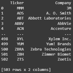
Figure 2. List of All the tickers included in the S&P 500.
2.2 Download Data with yfinance
Historical price data is available using yfinance.
We implement a batch downloading approach to reduce errors and avoid API rate limits.
import yfinance as yf
import pandas as pd
import time

def chunks(lst, n):
    for i in range(0, len(lst), n):
        yield lst[i:i + n]

start = "2015-01-01"
end = (pd.Timestamp.today() + pd.Timedelta(days=1)).strftime("%Y-%m-%d")
batch_size = 50
pause = 2

def fetch_batch(batch):
    backoff = 5
    while True:
        try:
            print(f"Downloading: {batch[:3]}…")
            data = yf.download(
                batch,
                start=start,
                end=end,
                group_by="ticker",
                auto_adjust=True,
                threads=False,
                progress=False
            )
            return data
        except Exception as e:
            if "429" in str(e):
                print(f"Rate limit. Wait {backoff}s…")
                time.sleep(backoff)
                backoff *= 2
            else:
                raise

# 1. Batch download
all_closes = []
missing = []

for batch in chunks(tickers, batch_size):
    data = fetch_batch(batch)
    closes = data.xs("Close", axis=1, level=1)
    valid = closes.dropna(axis=1, how="all")
    print(f"  Got {len(valid.columns)} valid")
    all_closes.append(valid)

    batch_missing = [t for t in batch if t not in valid.columns]
    if batch_missing:
        print(f"  Missing in batch: {batch_missing}")
        missing.extend(batch_missing)

    time.sleep(pause)

close = pd.concat(all_closes, axis=1)
2.3 Adjust for missing tickers
Tickers which are not found, will be added to a missing list. You should update this list to retrieve the remaining set of tickers.
For example, tickers with periods (like BRK.B) or other special cases need manual correction.
# 2. Manual corrections
corrections = {
    'BRK.B': 'BRK-B',
    'BF.B':  'BF-B'
    # add more mappings here
}

updated_missing = [corrections.get(t, t) for t in missing]
print(f"Will retry as: {updated_missing}")

# 3. Manual retry
manual_closes = []

for batch in chunks(updated_missing, batch_size):
    data = fetch_batch(batch)
    closes = data.xs("Close", axis=1, level=1)
    valid = closes.dropna(axis=1, how="all")
    print(f"  Got {len(valid.columns)} from {batch}")
    manual_closes.append(valid)
    time.sleep(pause)

manual_close_df = pd.concat(manual_closes, axis=1)

# 4. Combine without overwrite
new_all_closes = all_closes + manual_closes
new_close = pd.concat(new_all_closes, axis=1)

print("Original shape:", close.shape)
print("Updated shape:", new_close.shape)
Now, you can see all the data stored in the new_close dataframe.
new_close
Figure 3. Data Frame of Daily Prices for All S&P500 tickers since 2015.
2.4 Clean the Data
We clean the dataframe of all prices for potential inconsistencies.
We keep only tickers with a consistent price history and excluse those with excessive missing values.
# raw_close from your combined df
raw_close = new_close.copy()

# find tickers to keep
keep = []
for t in raw_close.columns:
    s = raw_close[t]
    first = s.first_valid_index()
    # skip if never traded
    if first is None:
        continue
    tail = s.loc[first:]
    miss_rate = tail.isna().mean()
    if miss_rate <= 0.05:
        keep.append(t)

# build cleaned df
clean_close = raw_close[keep].ffill()

print(f"Kept {len(keep)} tickers out of {len(raw_close.columns)}")
print("Clean shape:", clean_close.shape)
2.5 Get the S&P 500 Index Price Data
Breadth analysis compares individual stock action to the index itself.
Include index volume to support further analysis.
# ── download index data (close + volume)
idx_df = yf.download(
    "^GSPC",
    start=clean_close.index[0].strftime("%Y-%m-%d"),
    end=(pd.Timestamp.today() + pd.Timedelta(1)).strftime("%Y-%m-%d"),
    auto_adjust=True,
    progress=False,
)[["Close", "Volume"]]

# align to breadth dataframe dates
idx  = idx_df["Close"].reindex(clean_close.index).ffill()
idx_volume = idx_df["Volume"].reindex(clean_close.index).ffill()
3. Core Breadth and Trend Measures for the S&P 500
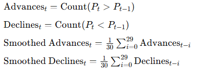
Here, we implement 4 signals to measure the Breadth of the S&P 500.
3.1 Percent Above Moving Averages
Calculate the percentage of stocks above their own moving averages each day.

3.2 Advance-Decline Line
Measure daily participation with advances minus declines. Cumulative sum forms the line.

3.3 Net New 52-Week Highs
For each date, subtract the number of new 52-week lows from new 52-week highs.

3.4 Smoothed Advances and Declines
Plot the 30-day moving average of advancing and declining stocks to show trends in daily participation.
import pandas as pd
import yfinance as yf
import matplotlib.pyplot as plt

plt.style.use('dark_background')

# ── price‑based indicators
sma50_idx  = idx.rolling(50).mean()
sma200_idx = idx.rolling(200).mean()
vwap200_idx = (idx * idx_volume).rolling(200 * 5).sum() / idx_volume.rolling(200 * 5).sum()

# ── breadth measures
sma50  = clean_close.rolling(50).mean()
sma200 = clean_close.rolling(200).mean()
pct_above_50  = (clean_close > sma50).sum(axis=1)  / clean_close.shape[1] * 100
pct_above_200 = (clean_close > sma200).sum(axis=1) / clean_close.shape[1] * 100

advances  = (clean_close.diff() > 0).sum(axis=1)
declines  = (clean_close.diff() < 0).sum(axis=1)
ad_line   = (advances - declines).cumsum()

# ── net new 52‑week highs
high52       = clean_close.rolling(252).max()
low52        = clean_close.rolling(252).min()
new_highs    = (clean_close == high52).sum(axis=1)
new_lows     = (clean_close == low52).sum(axis=1)
net_highs    = new_highs - new_lows
sma10_net_hi = net_highs.rolling(10).mean()

# ── figure
fig, (ax1, ax2, ax3, ax4) = plt.subplots(4, 1, sharex=True, figsize=(12, 12))

# price + MAs + VWAP
ax1.plot(idx.index, idx,            label='S&P 500 Price')
ax1.plot(sma50_idx.index,  sma50_idx,   label='50‑day MA')
ax1.plot(sma200_idx.index, sma200_idx,  label='200‑day MA')
ax1.plot(vwap200_idx.index, vwap200_idx, label='200‑week VWAP')
ax1.set_ylabel('Price')
ax1.legend(loc='upper left')
ax1.grid(False)

# % above MAs with zones
ax2.axhspan(0, 20,  facecolor='red',    alpha=0.3)
ax2.axhspan(20, 50, facecolor='yellow', alpha=0.3)
ax2.axhspan(50, 80, facecolor='green',  alpha=0.3)
ax2.plot(pct_above_50.index,  pct_above_50,  label='% Above 50‑day MA')
ax2.plot(pct_above_200.index, pct_above_200, label='% Above 200‑day MA')
xmin, _ = ax2.get_xlim()
ax2.text(xmin, 10, 'Weak',    va='center')
ax2.text(xmin, 35, 'Neutral', va='center')
ax2.text(xmin, 65, 'Strong',  va='center')
ax2.set_ylabel('Percent')
ax2.legend(loc='upper left')
ax2.grid(False)

# advance‑decline line
ax3.plot(ad_line.index, ad_line, label='A/D Line')
ax3.set_ylabel('A/D Line')
ax3.legend(loc='upper left')
ax3.grid(False)

# net 52‑week highs
ax4.bar(net_highs.index, net_highs, label='Net New 52‑Week Highs', alpha=0.4)
ax4.plot(sma10_net_hi.index, sma10_net_hi, label='10‑day SMA', linewidth=1.2)
ax4.set_ylabel('Net Highs')
ax4.set_xlabel('Date')
ax4.legend(loc='upper left')
ax4.grid(False)

plt.tight_layout()
plt.show()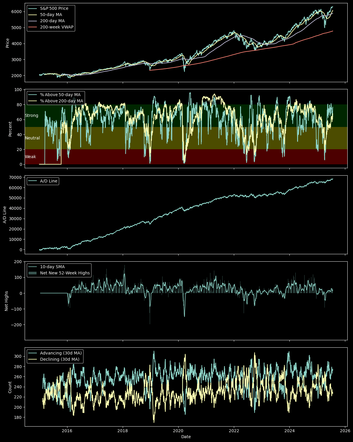
Figure 4. S&P 500 Breadth Dashboard. Four key signals track S&P 500 price, trend strength, internal breadth, and new highs.
From the results, we observe that the S&P 500 price holds above its long-term moving averages and show underlying trend support.
However, participation is narrowing, percent above 50-day and 200-day averages has faded from recent highs and hovers near neutral.
The advance-decline line flattens, no longer confirming new index highs. Net new 52-week highs are muted, with no clear leadership surge.
Smoothed advancing stocks now track closely with decliners and signal a less resilient rally. Recent market strength relies on fewer names.
4. Scan Short-Term Leaders and Laggards
We plot a heatmap of daily returns across all tickers to view granular breadth.
Green signals top gainers. Red highlights steep losers.
Clustering of colors marks sector rotations or broad market stress.
Outliers stand out as new momentum leaders or high-volatility names.
import numpy as np
import matplotlib.pyplot as plt

plt.style.use('dark_background')

# Parameters
n_days = 60  # how many days back to show

# 1. Compute daily returns and take the last n_days
ret_daily = clean_close.pct_change().iloc[1:]           # drop first NaN
ret_30    = ret_daily.iloc[-n_days:]                    # last 30 rows

# 2. Sort tickers by the most recent day’s return
order = ret_30.iloc[-1].sort_values(ascending=True).index
ret_30 = ret_30[order]

# 3. Clip color scale at 95th percentile of abs returns
abs_max = np.nanpercentile(np.abs(ret_30.values), 95)

# 4. Plot heatmap
fig, ax = plt.subplots(figsize=(12, 48))
im = ax.imshow(
    ret_30.T,
    aspect='auto',
    origin='lower',
    interpolation='none',
    cmap='RdYlGn',    # red = negative, yellow = zero, green = positive
    vmin=-abs_max,
    vmax= abs_max
)

# Y axis: tickers
ax.set_ylabel('Tickers (sorted by latest daily return)', fontsize=8)
ax.set_yticks(range(len(order)))
ax.set_yticklabels(order, fontsize=6)

# X axis: manual ticks for each date
n_dates = len(ret_30.index)
step = max(1, n_dates // 10)
xticks = list(range(0, n_dates, step))
ax.set_xticks(xticks)
ax.set_xticklabels(
    [ret_30.index[i].strftime('%Y-%m-%d') for i in xticks],
    rotation=45,
    ha='right',
    fontsize=8
)
ax.set_xlabel('Date', fontsize=8)

# Colorbar
cbar = fig.colorbar(im, ax=ax, pad=0.02)
cbar.set_label('Daily Return', fontsize=8)

ax.set_title(f'Last {n_days}-Day Daily Return Heatmap', fontsize=10)
ax.grid(False)

plt.tight_layout()
plt.show()
Figure 5. 60 Day Return Heatmap. Shows daily returns for each S&P 500 stock. Highlights leaders and laggards.
5. Compare Performance Across the Index
Not all stocks move with the index. Rebased price charts make it easy to see who leads, who lags, and which trends persist.
We rebase every stock to 100 over the past year. This shows relative performance: winners rise, laggards fall, and the S&P 500 index as the benchmark.
The “Magnificent 7” get highlighted to show their influence.
Top five and bottom five non-mega-cap performers stand out.
All other stocks plot in gray for context.
Log scale keeps large and small moves visible.
import numpy as np
import matplotlib.pyplot as plt
from matplotlib.ticker import LogLocator, ScalarFormatter

plt.style.use('dark_background')

# Parameters
n_days = 365
base   = 100

# ---------- data prep
recent   = clean_close.iloc[-n_days:].dropna(axis=1, how='any')
rebased  = recent.divide(recent.iloc[0]) * base

# performance over the window
perf = rebased.iloc[-1]                      # end value (100 = unchanged)

# MAG 7 tickers (keep only those present)
mag7_all = ['AAPL', 'MSFT', 'AMZN', 'META', 'GOOGL', 'NVDA', 'TSLA']
mag7     = [t for t in mag7_all if t in rebased.columns]

# top / bottom 5 (exclude MAG 7 so they don’t double‑count)
non_mag  = perf.drop(index=mag7, errors='ignore')
top5     = non_mag.nlargest(5).index.tolist()
worst5   = non_mag.nsmallest(5).index.tolist()

# colour map for MAG 7
mag_colors = {
    'AAPL':  '#e6194b',  # red
    'MSFT':  '#3cb44b',  # green
    'AMZN':  '#ffe119',  # yellow
    'META':  '#4363d8',  # blue
    'GOOGL': '#f58231',  # orange
    'NVDA':  '#911eb4',  # purple
    'TSLA':  '#46f0f0',  # cyan
}

# ------------------------------------------------------------------ plot
fig, ax = plt.subplots(figsize=(16, 8))

# background: all stocks in gray
ax.plot(rebased.index, rebased.values, color='gray', linewidth=1, alpha=0.4)

# MAG 7 highlighted
for tkr in mag7:
    ax.plot(rebased.index, rebased[tkr], color=mag_colors.get(tkr, 'white'),
            linewidth=2)
    ax.text(rebased.index[-1], rebased[tkr].iloc[-1],
            tkr, color=mag_colors.get(tkr, 'white'),
            fontsize=8, va='center', ha='left')

# top 5 performers (lime)
for tkr in top5:
    ax.plot(rebased.index, rebased[tkr], color='lime', linewidth=2)
    ax.text(rebased.index[-1], rebased[tkr].iloc[-1],
            tkr, color='lime', fontsize=8, va='center', ha='left')

# worst 5 performers (red)
for tkr in worst5:
    ax.plot(rebased.index, rebased[tkr], color='red', linewidth=2, linestyle='--')
    ax.text(rebased.index[-1], rebased[tkr].iloc[-1],
            tkr, color='red', fontsize=8, va='center', ha='left')

# S&P 500 overlay (thick white)
spx_rebased = idx.iloc[-n_days:] / idx.iloc[-n_days] * base
ax.plot(spx_rebased.index, spx_rebased.values, color='white', linewidth=3)

# -------- formatting
ax.set_yscale('log')

major = LogLocator(base=10, subs=(1.0,), numticks=12)
minor = LogLocator(base=10, subs=np.arange(2, 10) * 0.1, numticks=100)
ax.yaxis.set_major_locator(major)
ax.yaxis.set_minor_locator(minor)
ax.yaxis.set_major_formatter(ScalarFormatter())
ax.yaxis.set_minor_formatter(ScalarFormatter())
ax.tick_params(axis='y', which='both', colors='white', labelsize=8)
ax.tick_params(axis='x', colors='white')

ax.set_xlabel('Date')
ax.set_ylabel(f'Rebased Price (start = {base})')
ax.set_title(f'Price Level Comparison (Rebased, Log Scale) — Last {n_days} Days')
ax.grid(False)

plt.tight_layout()
plt.show()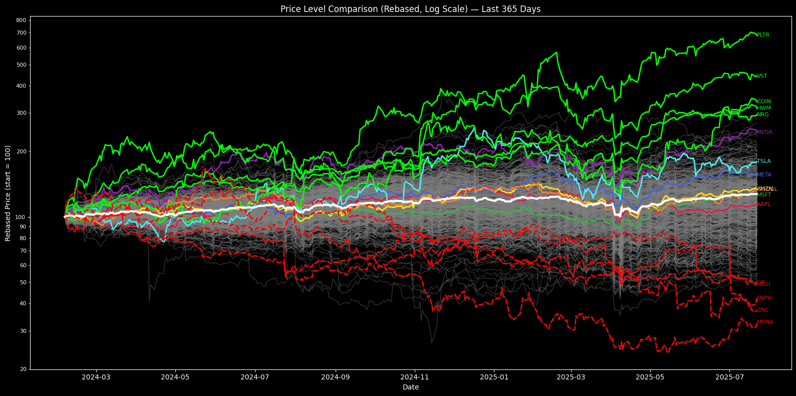
Figure 6. Rebased Price Comparison. Shows one year performance for every S&P 500 stock and the index. Magnificent 7, top five, and bottom five names stand out.
The full end-to-end workflow is available as a Google Colab notebook:
6. Rank Momentum by Percentile
Momentum leadership changes fast. Ranking stocks by their recent returns shows which names lead, which lag, and how sector rotation unfolds.
We compute each stock’s 30-day return and rank it against the rest of the index for each date.
30-day return:

Ri,t is the return for stock i on day t over n days, and P is the adjusted closing price.
Cross-sectional percentile rank:

N is the number of stocks with valid returns on day t. Stocks in the top percentiles are current momentum leaders.
The heatmap tracks these ranks through time to show rotations and persistent trends.
import matplotlib.pyplot as plt

plt.style.use('dark_background')

# Parameters
n_days = 30  # look-back period for momentum

# 1. Compute n-day returns
ret_n = clean_close.pct_change(n_days)

# drop the first n_days rows (NaNs)
ret_n = ret_n.iloc[n_days:]

# 2. Compute cross-sectional percentiles per date
#    rank returns from 0 to 1
perc = ret_n.rank(axis=1, pct=True)

# 3. Sort tickers by most recent percentile (optional)
order = perc.iloc[-1].sort_values(ascending=False).index
perc = perc[order]

# 4. Plot heatmap
fig, ax = plt.subplots(figsize=(12,48))
im = ax.imshow(
    perc.T,
    aspect='auto',
    origin='lower',
    interpolation='none'
)

# axis labels
ax.set_xlabel('Date')
ax.set_ylabel('Tickers (sorted by latest %ile)')
ax.set_yticks(range(len(order)))
ax.set_yticklabels(order, fontsize=6) # Adjusted font size here

# x-ticks: show a sample of dates
n_dates = len(perc.index)
step = max(1, n_dates // 10)
xticks = list(range(0, n_dates, step))
ax.set_xticks(xticks)
ax.set_xticklabels(
    [perc.index[i].strftime('%Y-%m-%d') for i in xticks],
    rotation=45,
    ha='right'
)

# colorbar
cbar = fig.colorbar(im, ax=ax, pad=0.02)
cbar.set_label('Return Percentile')

ax.set_title(f'{n_days}-Day Return Percentile Heatmap')
ax.grid(False)
plt.tight_layout()
plt.show()
Figure 7. 30 Day Momentum Percentile Heatmap. Ranks all S&P 500 stocks by recent 30 day return percentile. Exposes short term momentum shifts.
7. Limitations and Extensions
7.1 Limitations
Data quality issues, index rebalancing, and survivorship bias can distort signals.
S&P 500 membership shifts over time. Historical data may include stocks not present during the entire period.
Free sources may miss or misreport prices after ticker changes, splits, or mergers.
Breadth and momentum work best in trending markets. In choppy, range-bound environments, signals can lag.
Return heatmaps highlight outliers but do not reveal causes, e.g. earnings surprises, guidance changes, and sector news may explain extreme moves.
7.2 Forward-looking Metrics and Deeper Extensions:
Combine breadth and momentum signals with forward-looking metrics like earnings revisions, analyst upgrades, and macroeconomic data.
Layer in estimate dispersion, growth guidance, or changes in buyback activity to flag shifts before they appear in price trends.
Use options market signals (skew, implied volatility) as a second layer to detect risk buildup not visible in price or breadth alone.
Segment breadth by sector or market cap to catch early rotation and crowding effects.
Adjust for index additions and deletions to remove survivorship bias and get a clearer read on true participation.
Concluding Thoughts
The best insights come from combining breadth, momentum, and forward-looking data then questioning what the signals really mean.
Staying curious is as important as staying systematic.


