
In partnership with

This isn’t traditional business news

Welcome to Morning Brew—the free newsletter designed to keep you in the know on the business news impacting your career, company, and life—in a way you didn’t know you needed.
Note: this isn’t traditional business news. Morning Brew’s approach cuts through the noise and bore of classic business media, opting for short writeups, witty jokes, and above all—presenting the facts.
Save time, actually enjoy business news, and join over 4 million professionals reading daily.
Exciting News: Paid Subscriptions Have Launched! 🚀
On September 1, we officially rolled out our new paid subscription plans at GuruFinance Insights, offering you the chance to take your investing journey to the next level! Whether you're just starting or are a seasoned trader, these plans are packed with exclusive trading strategies, in-depth research paper analysis, ad-free content, monthly AMAsessions, coding tutorials for automating trading strategies, and much more.
Our three tailored plans—Starter Investor, Pro Trader, and Elite Investor—provide a range of valuable tools and personalized support to suit different needs and goals. Don’t miss this opportunity to get real-time trade alerts, access to masterclasses, one-on-one strategy consultations, and be part of our private community group. Click here to explore the plans and see how becoming a premium member can elevate your investment strategy!
Check Out Latest Premium Articles


When it comes to trading stocks, understanding the underlying trends and market movements is key. One powerful tool in a trader’s arsenal is the Money Flow Index (MFI). In this article, we’ll dive deep into what MFI is, how it’s calculated, and how you can visualize it using Python and Plotly. 🌟

What is MFI? 🤔
The Money Flow Index (MFI) is a momentum indicator that combines price and volume to measure the buying and selling pressure. Unlike the Relative Strength Index (RSI), which only considers price, MFI incorporates both price and volume to provide a more comprehensive view of market strength.
Tackle your credit card debt by paying 0% interest until 2026
Reduce interest: 0% intro APR helps lower debt costs.
Stay debt-free: Designed for managing debt, not adding.
Top picks: Expert-selected cards for debt reduction.
Why is MFI Important? 📊
Identify Overbought/Oversold Conditions: An MFI above 80 can suggest strong buying pressure, while below 20 indicates selling pressure. However, it’s not just about overbought or oversold signals; high MFI can also indicate strong trends.
Confirm Trends: MFI can help confirm the strength of a trend. Rising MFI during an uptrend reinforces the bullish momentum, and vice versa for a downtrend.
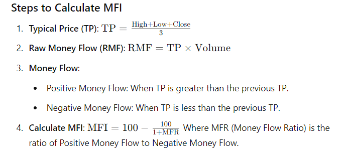
How is MFI Calculated? 🧮
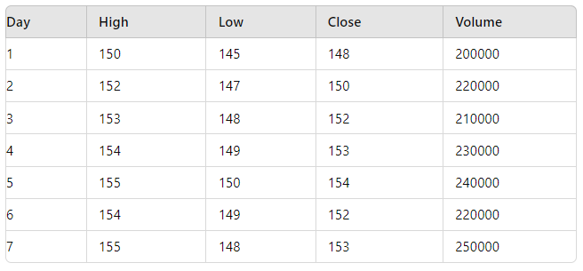
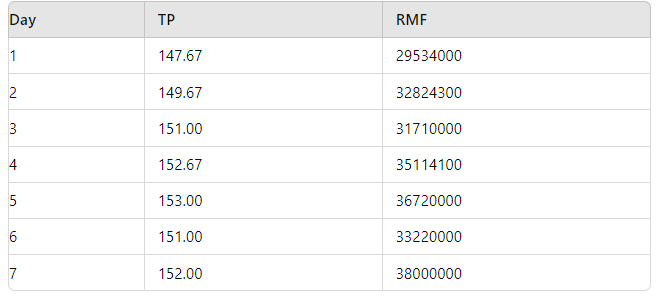
Let’s break it down with an example. Suppose we have stock data for a period of 7 days:
Example Calculation 🔢
Consider the following data over 7 days:
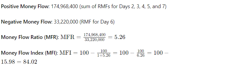
An MFI of 84.02 indicates strong buying pressure, suggesting a strong upward trend rather than merely an overbought condition.
Choosing the Period for MFI Calculation
Shorter Periods (e.g., 7 days):
Pros: More responsive to recent price and volume changes. Useful for short-term trading strategies.
Cons: May generate more noise and false signals due to higher sensitivity.
Longer Periods (e.g., 21 days or 30 days):
Pros: Smoother and less sensitive to short-term fluctuations. Better for medium to long-term analysis.
Cons: May lag behind current price movements and provide fewer signals.
Example with Code 🖥️
Here’s how you can calculate and visualize MFI using Python with the yfinance and plotly libraries.
import yfinance as yf
import pandas as pd
import plotly.graph_objects as go
from plotly.subplots import make_subplots

def calculate_mfi(df, period=14):
    df['Typical Price'] = (df['High'] + df['Low'] + df['Close']) / 3
    df['Raw Money Flow'] = df['Typical Price'] * df['Volume']
    df['Money Flow'] = df['Raw Money Flow'].where(df['Typical Price'] > df['Typical Price'].shift(1), 0)
    df['Negative Money Flow'] = df['Raw Money Flow'].where(df['Typical Price'] < df['Typical Price'].shift(1), 0)

    df['Positive Money Flow'] = df['Money Flow'].rolling(window=period).sum()
    df['Negative Money Flow'] = df['Negative Money Flow'].rolling(window=period).sum()

    df['MFI'] = 100 - (100 / (1 + (df['Positive Money Flow'] / df['Negative Money Flow'])))

    return df

# Fetch stock data
ticker = 'AAPL'  # Apple Inc.
data = yf.download(ticker, start='2023-01-01', end='2024-01-01')

# Calculate MFI
data = calculate_mfi(data)

# Create subplots
fig = make_subplots(rows=2, cols=1, shared_xaxes=True, vertical_spacing=0.1,
                    subplot_titles=('Stock Price', 'Money Flow Index (MFI)'),
                    row_heights=[0.7, 0.3])

# Plot stock price
fig.add_trace(go.Candlestick(x=data.index,
                             open=data['Open'],
                             high=data['High'],
                             low=data['Low'],
                             close=data['Close'],
                             name='Candlestick',
                             increasing_line_color='green', decreasing_line_color='red'),
              row=1, col=1)

# Plot MFI
fig.add_trace(go.Scatter(x=data.index,
                         y=data['MFI'],
                         mode='lines',
                         name='MFI',
                         line=dict(color='red')),
              row=2, col=1)

# Update layout
fig.update_layout(title=f'{ticker} Stock Price and Money Flow Index (MFI)',
                  xaxis_title='Date',
                  yaxis_title='Price',
                  yaxis2_title='MFI',
                  xaxis_rangeslider_visible=False)

# Show the plot
fig.show()
Visualizing MFI 📉
The code above will fetch Apple Inc. (AAPL) stock data and plot both the candlestick chart and the Money Flow Index (MFI) on a subplot. The candlestick chart shows price movements, while the MFI plot helps in analyzing the buying and selling pressure over time.
Key Takeaways 🌟
MFI is a valuable tool for gauging market sentiment and trends.
By integrating MFI with price data, traders can get a clearer picture of market dynamics.
Visualization through Plotly makes it easy to interpret and analyze MFI in real-time.
Feel free to experiment with different periods and stocks. For a hands-on experience, you can access and modify the example code in the Google Colab notebook provided below:
Happy trading and coding! 🚀📈