
In partnership with

`
The future of moving starts here.

Where you live shapes how you live. We make moving simpler, clearer, and better with tools that guide you from exploring new places to settling in.
Read the Offering information carefully before investing. It contains details of the issuer’s business, risks, charges, expenses, and other information, which should be considered before investing. Obtain a Form C and Offering Memorandum at https://wefunder.com/lookyloo
Exciting News: Paid Subscriptions Have Launched! 🚀
On September 1, we officially rolled out our new paid subscription plans at GuruFinance Insights, offering you the chance to take your investing journey to the next level! Whether you're just starting or are a seasoned trader, these plans are packed with exclusive trading strategies, in-depth research paper analysis, ad-free content, monthly AMAsessions, coding tutorials for automating trading strategies, and much more.
Our three tailored plans—Starter Investor, Pro Trader, and Elite Investor—provide a range of valuable tools and personalized support to suit different needs and goals. Don’t miss this opportunity to get real-time trade alerts, access to masterclasses, one-on-one strategy consultations, and be part of our private community group. Click here to explore the plans and see how becoming a premium member can elevate your investment strategy!
Check Out Latest Premium Articles


Visualizing information can provide invaluable insights that are not easily discernible from raw data alone. Among various types of data visualizations, bubble charts offer a unique way of representing relationships between multiple dimensions of data. In this article, we’ll explore how to create an interactive Python bubble chart to analyze the number of news articles published over time for a specific stock ticker.
By visualizing media coverage, we can uncover patterns that might correlate with stock price movements or corporate events. Media attention often mirrors and amplifies market sentiment, making this analysis valuable for investors and researchers alike.
Smarter Investing Starts with Smarter News
The Daily Upside helps 1M+ investors cut through the noise with expert insights. Get clear, concise, actually useful financial news. Smarter investing starts in your inbox—subscribe free.
Introduction to the Concept
Bubble charts are well-suited for three-dimensional data representation:
X-axis: The timeline (e.g., months or years).
Y-axis: The frequency or count of published articles.
Bubble Size: Highlights the magnitude of news coverage for each period.
This method of visualization helps us identify trends, outliers, or significant increases in news volume that may indicate major developments for a stock. Using Python, we can:
Fetch news data using the Financial Modeling Prep API.
Process the data to aggregate monthly article counts.
Create and enhance the bubble chart with interactive features.
By the end of this tutorial, you will have a script that not only visualizes news volume but also allows for intuitive exploration.
Prerequisites
Ensure the following Python libraries are installed in your environment:
requests: For fetching data from APIs.
pandas: For data manipulation and aggregation.
matplotlib: For creating bubble charts.
numpy: For numerical operations like normalization.
Install these packages using pip if necessary:
pip install requests pandas matplotlib numpyStep 1: Fetching News Data
We will use the Financial Modeling Prep API to fetch news articles related to a given stock ticker. The API provides article publication dates and associated metadata.
import requests
import pandas as pd

# Initialize variables
ticker = "NVDA"  # Replace with your preferred stock ticker
base_url = "https://financialmodelingprep.com/api/v3/stock_news"
page = 0
max_pages = 1500  # Number of pages to fetch (adjust as needed)
news_data = []
api_key = "<your_api_key>"  # Replace with your API key

# Fetch articles from multiple pages
while page < max_pages:
    response = requests.get(f"{base_url}?tickers={ticker}&page={page}&apikey={api_key}")
    if response.status_code == 200:
        articles = response.json()
        if not articles:
            break  # Stop fetching if no articles are returned
        news_data.extend(articles)
        page += 1
    else:
        print(f"Failed to fetch data on page {page}. HTTP Status Code: {response.status_code}")
        break

# Convert the fetched data into a DataFrame
df = pd.DataFrame(news_data)
In this script, we iterate over multiple pages to collect all available articles, creating a DataFrame for processing. Be sure to replace <your_api_key> with your actual API key.
Step 2: Data Processing and Aggregation
Once we have the raw data, we process it to extract the publication dates and count the number of articles per month.
# Convert the 'publishedDate' column to datetime format
df['publishedDate'] = pd.to_datetime(df['publishedDate'])

# Extract the year and month from the publication date
df['YearMonth'] = df['publishedDate'].dt.to_period('M')

# Count the number of articles per month
article_counts = df['YearMonth'].value_counts().sort_index()
This step ensures that our data is grouped and summarized by month. By using the to_period('M') function, we efficiently bucket dates into monthly intervals.
Step 3: Creating the Bubble Chart
Bubble charts provide an intuitive and visually compelling way to display the aggregated data.
import matplotlib.pyplot as plt
import numpy as np

# Normalize article counts for color mapping
norm = plt.Normalize(article_counts.min(), article_counts.max())
colors = plt.cm.viridis(norm(article_counts.values))

# Plot the bubble chart
fig, ax = plt.subplots(figsize=(12, 8))
scatter = ax.scatter(
    article_counts.index.astype(str),  # Convert index to string for x-axis labels
    article_counts,  # Y-axis represents article counts
    s=article_counts * 100,  # Bubble size scales with article count
    c=colors,  # Color map for bubbles
    alpha=0.6,  # Transparency level
    cmap='viridis'  # Color map
)

# Add a color bar to indicate article volume
cbar = plt.colorbar(scatter, ax=ax)
cbar.set_label('Number of Articles')

# Customize the chart appearance
ax.set_xlabel('Year-Month')
ax.set_ylabel('Number of Articles')
ax.set_title(f'News Volume Over Time for {ticker}')
plt.xticks(rotation=45)
plt.grid(alpha=0.3)
Step 4: Adding Interactivity
Enhancing the chart with interactive elements provides an engaging experience for users. By hovering over bubbles, viewers can see detailed annotations for each data point.
# Add interactivity to display annotations
def update_annotation(ind):
    pos = scatter.get_offsets()[ind["ind"][0]]
    annot.xy = pos
    text = f"{article_counts.index[ind['ind'][0]]}: {article_counts.iloc[ind['ind'][0]]} articles"
    annot.set_text(text)
    annot.get_bbox_patch().set_facecolor('white')
    annot.get_bbox_patch().set_alpha(0.6)

annot = ax.annotate(
    "",
    xy=(0, 0),
    xytext=(15, 15),
    textcoords="offset points",
    bbox=dict(boxstyle="round", facecolor="white", edgecolor="gray"),
    arrowprops=dict(arrowstyle="->")
)
annot.set_visible(False)

# Connect hover functionality to the figure
def on_hover(event):
    if event.inaxes == ax:
        cont, ind = scatter.contains(event)
        if cont:
            update_annotation(ind)
            annot.set_visible(True)
            fig.canvas.draw_idle()
        else:
            annot.set_visible(False)
            fig.canvas.draw_idle()

fig.canvas.mpl_connect("motion_notify_event", on_hover)
Observations and Insights
When visualized for companies like NVIDIA (NVDA), Palantir (PLTR), or Hims & Hers Health (HIMS), the bubble chart reveals:

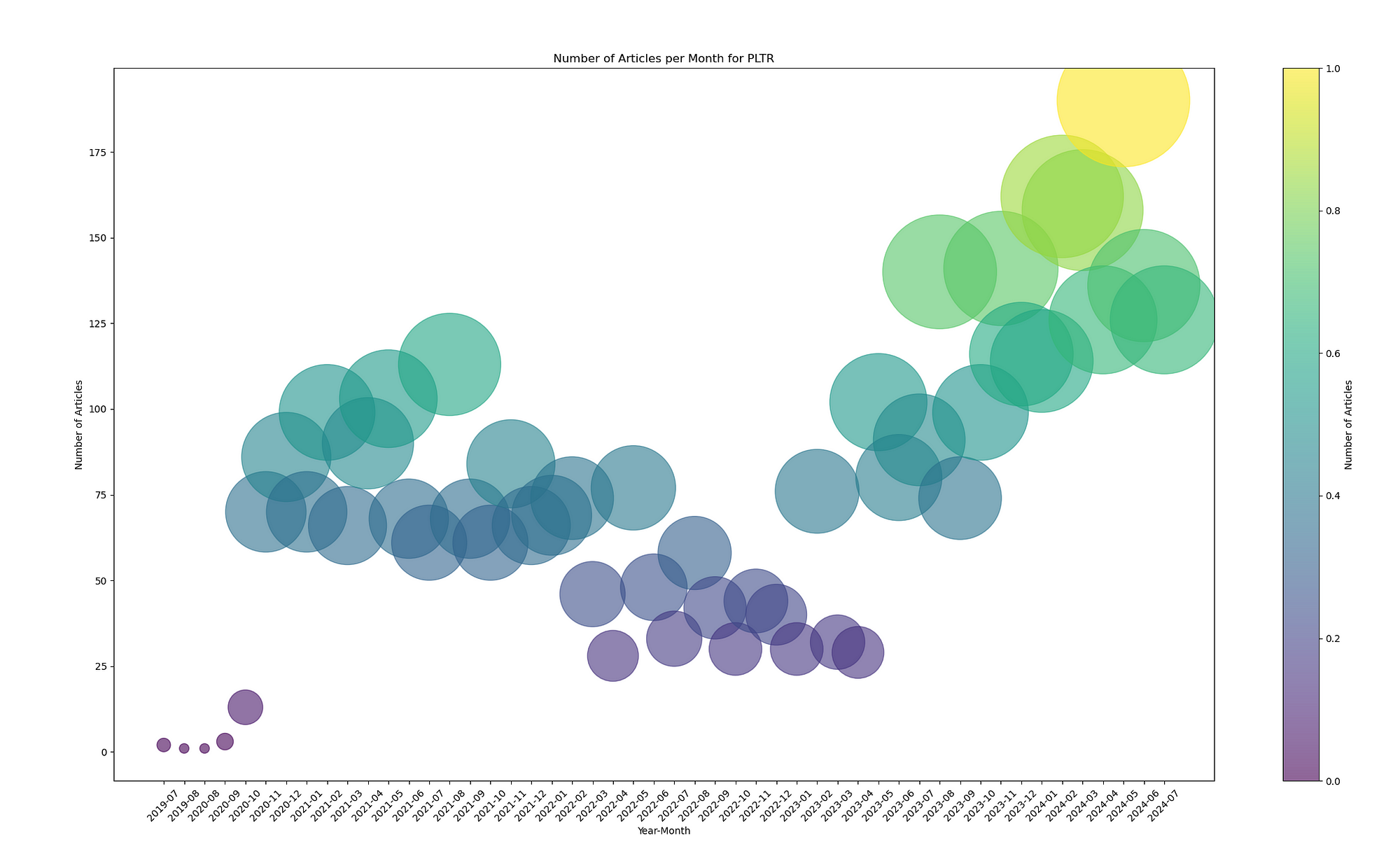
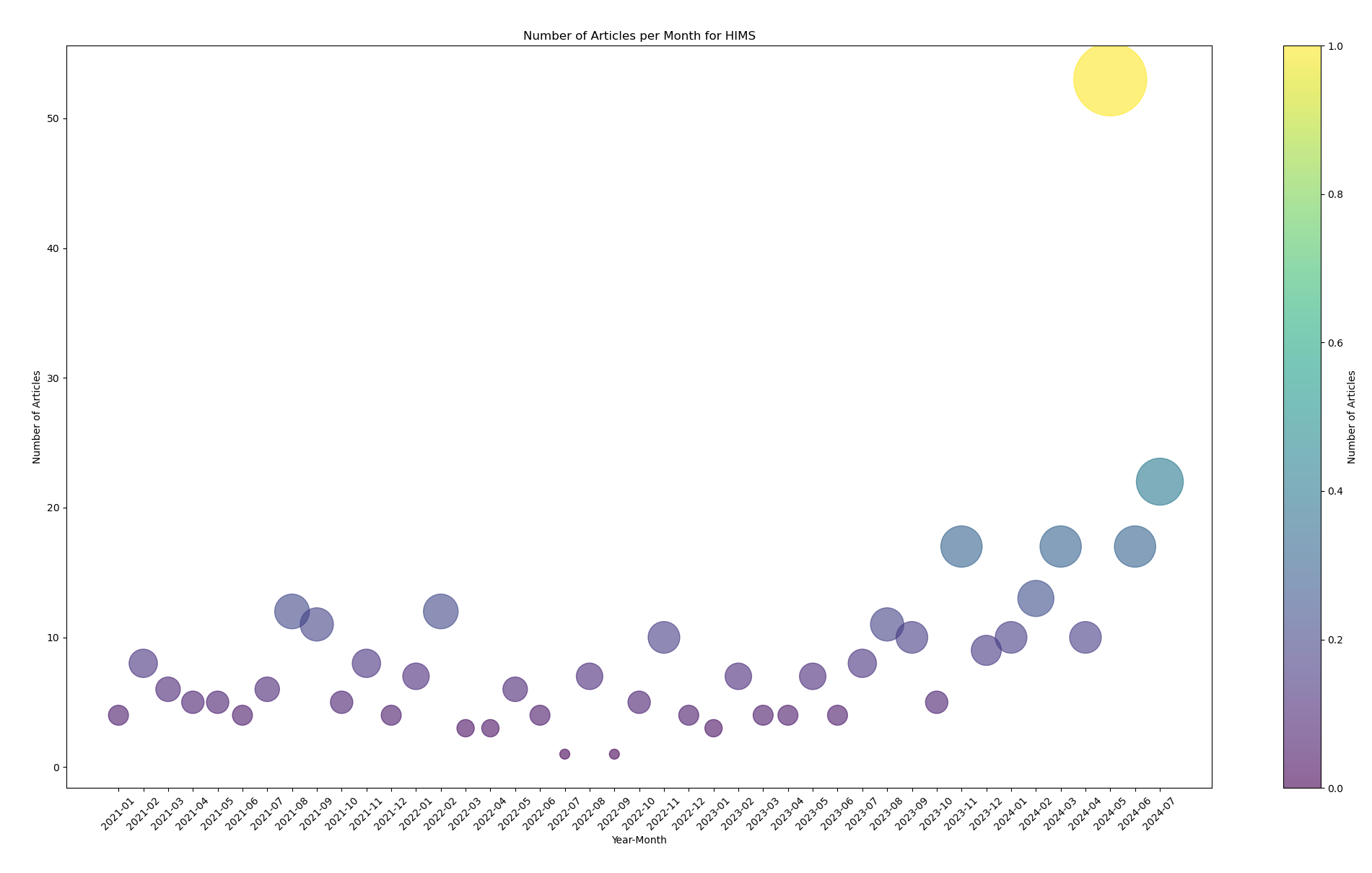
Periods of heightened media coverage typically correlate with significant market events (e.g., product launches, earnings reports, regulatory changes).
Sustained increases in news volume may signal heightened market attention or speculation.
Comparing media coverage across different companies may reveal relative interest and sentiment trends.
Key Takeaways
Media Impact: Increased news coverage often precedes stock price volatility, though this requires further analysis for confirmation.
Pattern Detection: Visualization makes patterns in data obvious at a glance, facilitating more informed analysis.
Interactive Features: Adding interactivity enables a richer user experience, allowing real-time exploration of the data.
This Python script serves as a starting point for integrating media sentiment analysis into your research or investment workflow.
Complete Source Code
Access the full source code on GitHub: fin_visualization/src/news_volume_visualization.py
Final Note
This visualization is for informational purposes only and does not constitute investment advice. Always perform your due diligence or consult a financial professional before making investment decisions.